The brief
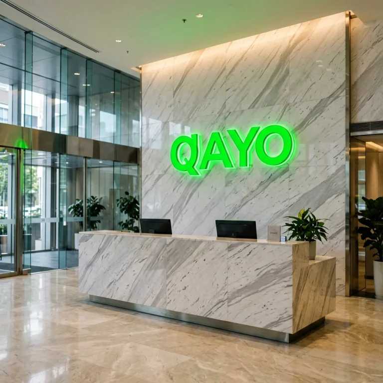
A US-headquartered financial services group was consolidating several regional offices into one new headquarters building. The lobby had one job to do from the moment a visitor walked through the doors: state the company name, unmistakably, in the company’s own brand green. The internal design team had already fixed its brand standards — an exact Pantone reference, an exact logotype and strict minimum clear space — and needed a manufacturing partner who could translate those rules into physical illuminated letters rather than reinterpret them.
Two elements were in scope: a set of brand letters over the reception backdrop wall, and a smaller illuminated logo plaque for the executive floor lift lobby, built to the same standard so the brand reads identically on both floors.
What we built
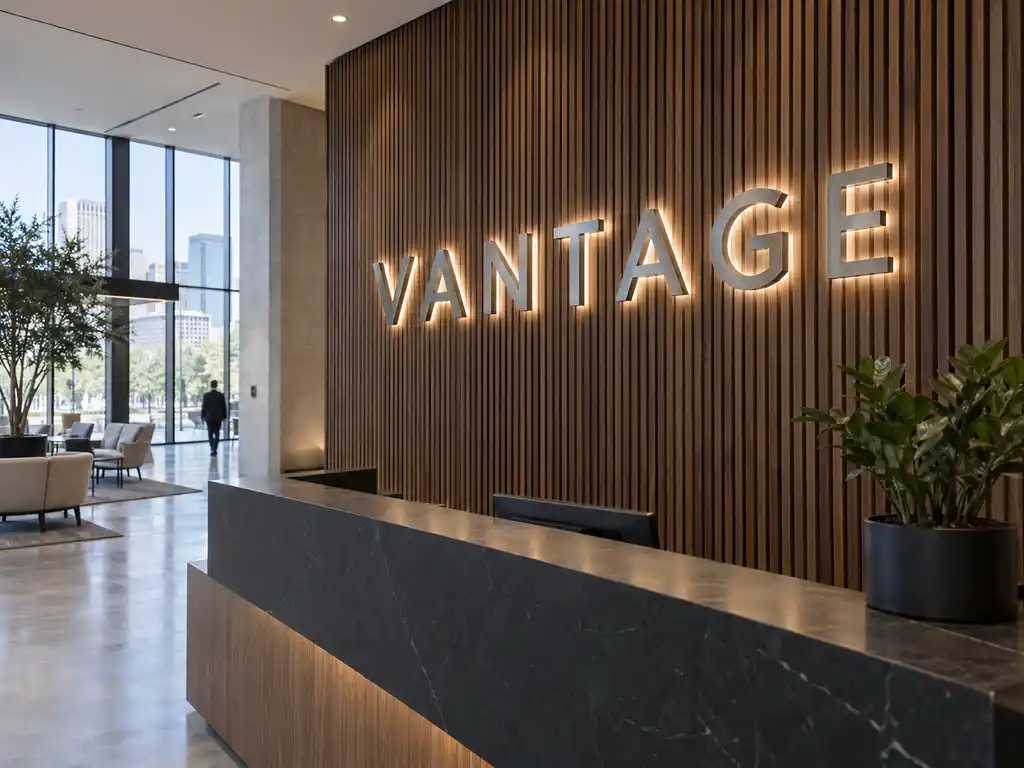
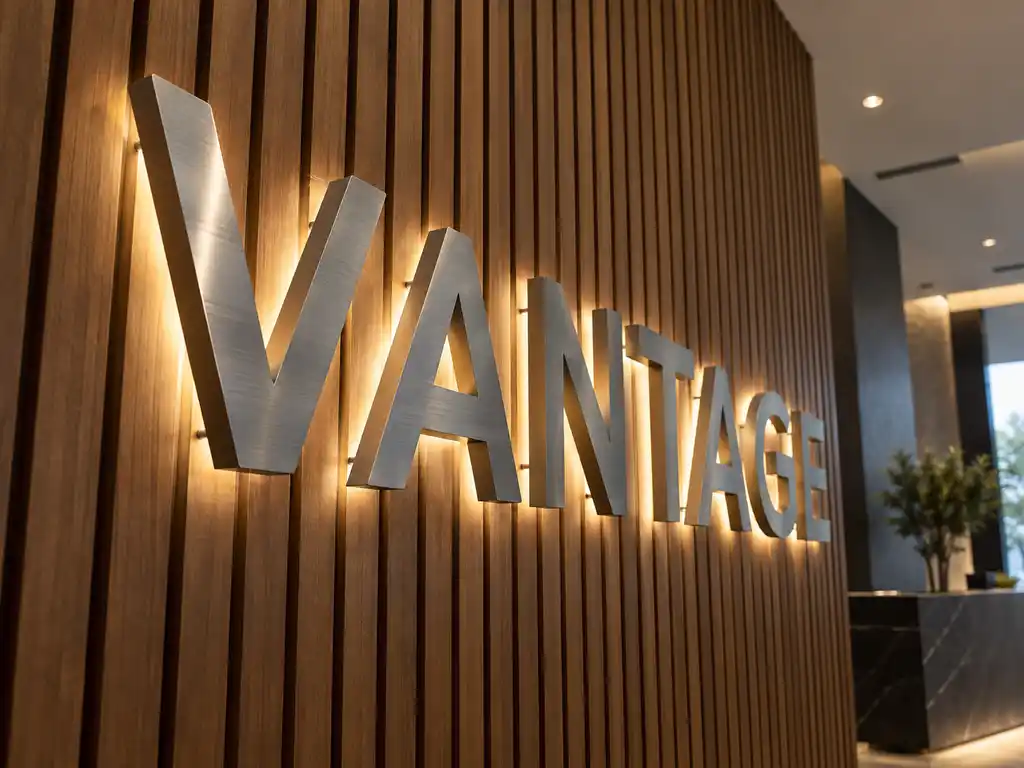
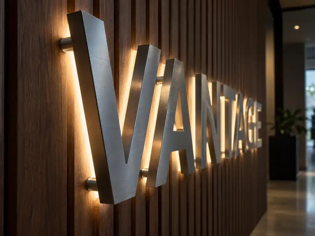
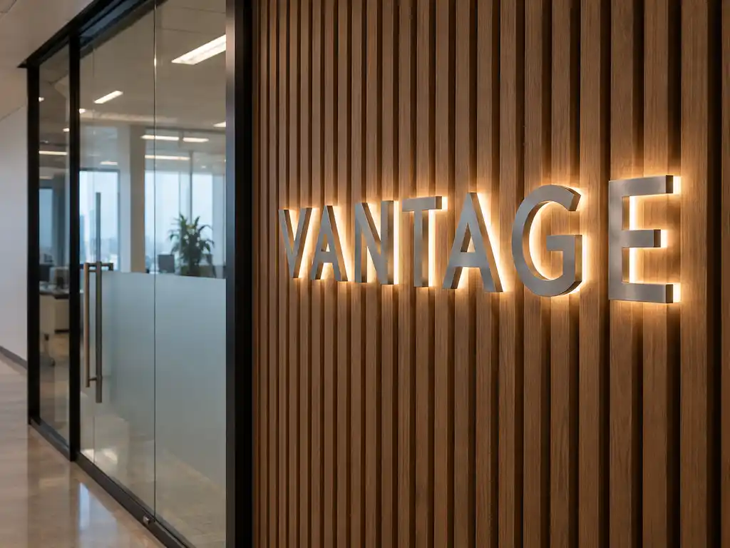
We produced the lobby letters as brushed stainless steel returns carrying a baked-paint face colour-matched to the client’s brand green, lit with a soft halo that lifts the letters off the stone wall without washing out the logotype. The executive floor plaque reuses the same letter profile as a compact back-lit wall sign with an electroplated stainless steel face, so the metal finish matches the architecture upstairs while the halo treatment stays consistent with the lobby.
- Letter construction: brushed stainless steel return with a colour-matched face, letter depth tuned to the lobby viewing distance (30 mm – 80 mm within our standard range)
- Finish: baked-paint face on the lobby letters; electroplated stainless steel face on the executive plaque — both UV-stable, both matched to the client’s brand colour reference
- Illumination: backlit halo behind each letter, SMD 2835 / 5050 LED modules rated for more than 50,000 hours
- Power supply: MEAN WELL™ constant-current drivers, 12V/24V DC
- Mounting: flush wall mount on concealed stand-offs, with a 1:1 paper template, wiring diagram and installation notes supplied per wall
- Rating: indoor IP20, correct for a climate-controlled lobby and lift lobby
How the project ran
Signage is a physical product, so the process is deliberately front-loaded. The client supplied the logotype as vector artwork, the Pantone reference and photographs of both walls with rough dimensions. We returned a scaled letter layout drawn onto those photographs so the design team could approve proportion and clear space against the real architecture before anything was cut.
Because the two walls sit at different viewing distances — the lobby wall is read from across a double-height entrance hall, the lift lobby from a few steps away — we specified two letter depths rather than one. A single prototype letter was then produced and shipped ahead of the main run for sign-off on colour, finish and halo brightness under the client’s own lobby lighting. Only once that sample was approved did the full set go into production. Typeface, stroke weight, colour temperature and metal finish were locked at that point and never varied between the two signs.
Delivery and installation
The completed letters shipped as a single crated set via air freight, with the 1:1 mounting templates rolled separately so nothing was compressed against the painted faces in transit. Each letter was individually wrapped and labelled to its position on the wall, which meant no letter had to be re-identified on site.
The client’s own contractor handled the physical fit-out, working from our templates and wiring diagram. Because the drivers were pre-wired and the mounting points pre-drilled, the installation was a matter of fixing the template, drilling to the marked positions and hanging the letters in sequence. Our team stayed available through the install window for photographs and any dimension queries, and the client’s facilities team was left with a wiring diagram for future maintenance.
Outcome
The client now has one production file for its illuminated identity. A replacement letter, or the same sign for a future office, is quoted against the original specification — same colour reference, same depth, same halo — instead of starting a fresh design round. The lobby and the executive floor read as one brand, which was the entire point of standardising on a single signage partner.