The brief
A fast-food drive-thru chain in the United States was standardising its two-lane drive-thru format across the estate. Every site had been built by a different regional contractor, and the drive-thru had become the weakest part of the brand experience. Canopy letters read flat and dim after dark, the ordering point was under-lit, and no two sites used the same materials or the same light temperature. Crews at the busiest locations were fielding the same complaint from drivers: the menu was hard to read from the car until the window was already open.
The chain wanted a drive-thru package it could repeat rather than redesign. Illuminated letters on the canopy fascia above both ordering lanes, and backlit menu-board light boxes at the order point and at the pick-up confirmation position. All of it had to survive a working drive-thru — driving rain, summer UV, and the heat and exhaust of a lane that runs from early morning to late night — and it had to read identically at every location, because a chain only looks like a chain when the light matches.
What we built
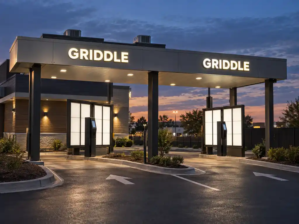
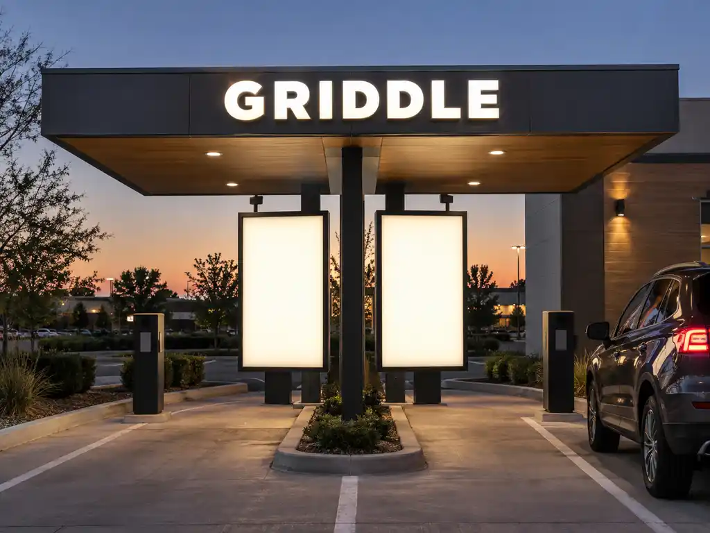
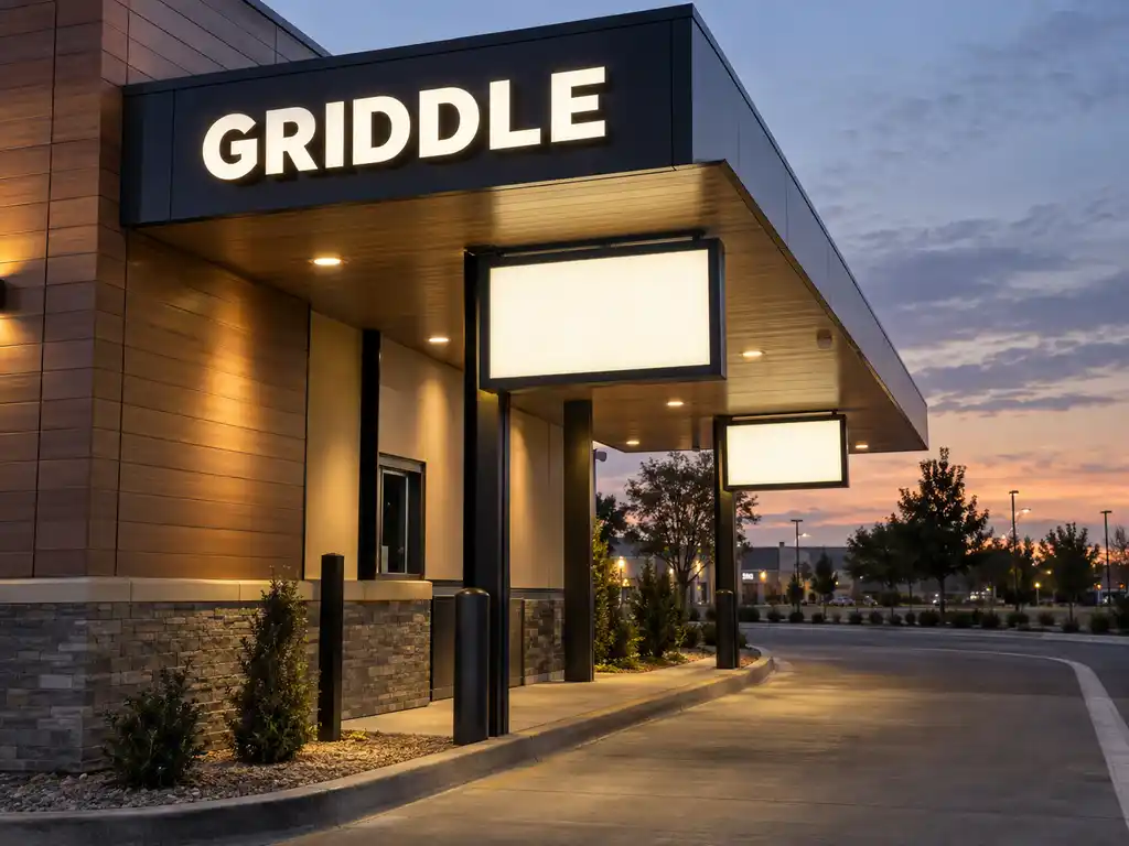
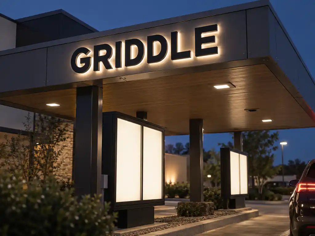
We produced two illuminated elements for the drive-thru, built on one light standard: backlit channel letters for the canopy fascia, and overhead menu-board light boxes for the ordering lanes.
The canopy letters are backlit channel letters with stainless steel returns and white acrylic faces, lit by a uniform halo behind the face rather than by a bright point source. Drivers approach a canopy from below and at an angle, so the letters have to stay legible from a low, oblique view — face brightness alone does not achieve that. Depth does: the letter returns sit deep enough for the halo to spread evenly before it reaches the face, which is why we specified depth per lane rather than applying one house standard to every canopy.
The menu boards are acrylic light boxes with aluminium frames and translucent acrylic faces, back-lit by an LED matrix that holds 2,000–3,000 cd/m² across the whole panel. Even light matters more here than peak brightness: a board that is hot in the middle and dim at the corners makes drivers squint at exactly the moment they need to decide. At the pick-up position we used the outdoor-rated stainless steel light box, where a 304 stainless steel bezel and a sealed back-lit LED matrix stand up both to weather and to the occasional scrape from a vehicle.
- Canopy letters: backlit channel letters with stainless steel returns and white acrylic faces, uniform LED halo behind the face
- Menu-board light boxes: back-lit LED matrix, 2,000–3,000 cd/m² held across the full face
- Menu-board construction: translucent acrylic face in an aluminium frame, 30–60 mm profile
- Pick-up position boards: 304 stainless steel bezel with acrylic face, 40–80 mm profile
- LED source: SMD 2835 / 5050 modules, rated for more than 50,000 hours
- Power supply: MEAN WELL™ constant-current drivers, 12V/24V DC, 15–60 W per sqm depending on brightness
- Letter depth: 30–150 mm, set per lane to suit the viewing angle from the car
- Rating: IP65 with weather sealing on the canopy run and the outdoor boards
- Warranty: 2 years on LED components
- Repeatable spec: one production drawing per drive-thru type, reused at every location
How the project ran
Signage is a physical product, so the process is deliberately front-loaded. The chain supplied its logotype as vector artwork, a colour reference, photographs of a reference site, and the dimensions of the canopy fascia plus the two menu-board positions. We returned scaled layouts drawn onto those photographs — the canopy letters set out along the true fascia run, each menu board shown at its real height and offset from the lane — so the brand team could judge proportion from the driver’s eyeline before anything was fabricated.
Two questions only a physical sample can settle: whether the halo behind the canopy letters was deep enough to read from a low approach, and whether the menu-board face stayed even at the corners. We produced one prototype canopy letter and one sample menu board and shipped them ahead of the main run for sign-off. The chain confirmed the warm-white temperature, the halo depth and the face uniformity from those samples, and only then did the full order go into production.
Standardising the drawings was the real work. Once the fascia letter run, the menu-board faces and the mounting points were fixed for the first drive-thru layout, every later location reused the same files. That is what keeps a multi-location rollout consistent, and it is also why a replacement board fitted in year three matches the ones installed in year one.
Delivery and installation
Each location shipped as its own labelled crate — canopy letters in one, menu boards in another — with a 1:1 mounting template, a drilling plan and a wiring diagram packed inside, together with the mounting hardware for each assembly. The chain’s own installers fitted everything from our drawings, which kept site access and scheduling under the contractor’s control while the drive-thru stayed closed for the shortest possible window.
Because the letters mount to the underside and outer face of the canopy, the drawings set the fixing points relative to the canopy frame so nothing landed on a seam or a structural rib. The menu boards were fitted to a rail of pre-drilled points, so each face could be levelled letter by letter and then powered as one circuit. Every site was then powered up at dusk and checked panel by panel — canopy run first, then the order point, then the pick-up boards — with brightness balanced so that no single element overpowered the next one down the lane.
Outcome
The chain now runs its drive-thru on one specification: canopy letters that stay readable from a low approach, and menu boards that hold their brightness to the corners of the panel, at every location. New sites are ordered as a repeat of the same production files rather than a fresh design job, and a damaged board or a single failed letter is a reorder against a drawing the factory already holds — not a redesign. That is the difference between a rollout and a collection of signs.