The brief
A restaurant & food service group in the United States was rolling out new locations and re-fronting existing ones, and its storefronts had been built by different contractors to different standards. One site had flat vinyl lettering that read dull under street lighting, another had a fascia sign that was too dim to be legible from the road, and almost none of them carried a projecting sign that pedestrians on the sidewalk would actually notice. What the group needed was not another one-off sign but a repeatable storefront package: a blade sign that projects over the pavement, fascia letters that light the shopfront evenly, and a specification identical enough that every new location could be ordered without redesigning it.
What we built
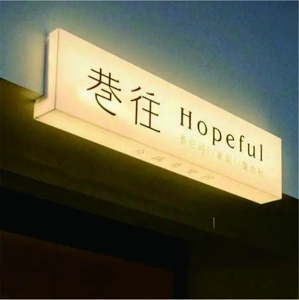
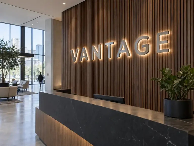
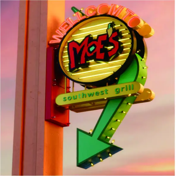
We produced a two-part storefront package for the group: a double-sided projecting light box that hangs above the entrance canopy as the blade sign, and a run of backlit LED channel letters mounted across the fascia. Both parts are built on the same aluminium construction and the same warm-white LED standard, so a blade sign and a fascia run photographed side by side read as one brand rather than two separate purchases.
The blade sign matters because it is visible along the sidewalk, not just from the front. Because the light box is illuminated on both faces, a customer walking in either direction sees the same lit graphic. The slim aluminium frame and cable-and-arm suspension keep the sign visually light against the fascia, and the whole assembly sits on a projecting arm that clears the canopy line so nothing is shadowed by the structure above it.
- Blade sign: double-sided hanging light box, illuminated on both faces for two-way sidewalk visibility
- Blade construction: slim aluminium frame with a cable suspension and wall-mount projecting arm
- Fascia letters: backlit LED channel letters with a uniform halo illumination behind the face
- Finish and face: brushed metal letter returns with a clean acrylic face, customisable in colour, font and lighting temperature
- Illumination: warm-white LED modules, sized so blade and fascia read at the same brightness in daylight and after dark
- Repeatable spec: one set of production files per store type — new locations are ordered against the same drawing, not redesigned
The blade sign is based on our double-sided hanging light box range and the fascia run on our backlit storefront channel letters and white 3D backlit channel letters, so a replacement blade or a new letter set can be reordered against the same production files as the original build.
How the project ran
The group supplied the brand logotype, its colour references and photographs of each facade, together with an indication of which locations were blade-only and which were getting both signs. We returned a scaled storefront layout for one reference location — the blade sign drawn at its true projection over the sidewalk and the fascia letters laid out to the actual shopfront width — so the group could see the proportions before committing to a multi-location order.
Because channel letters and a projecting light box cannot be judged from a screen, we built a single sample blade sign and one fascia letter for physical sign-off. The group confirmed the warm-white temperature, the halo depth behind the letters and the brightness balance between the projected sign and the fascia run. Only then did production start on the full set of locations.
Standardising the drawing was the real work. Once the blade projection, letter depth and mounting points were fixed for the first store type, every later location reused the same files, which is what keeps a chain looking like a chain.
Delivery and installation
The blade signs and letter sets shipped in labelled crates, one crate per location, each packed with a mounting template, a drilling plan and wiring notes so the group’s own installers could work from the same drawing at every site. The blade sign arrived assembled on its projecting arm for the installers to fix straight to the facade; the fascia letters went up on a rail of pre-drilled mounting points so the run could be levelled letter by letter and then powered as one circuit.
Because every location used the same mounting geometry, the second and third sites were fitted faster than the first — the crew was repeating a known job rather than solving a new one. Where a storefront had a canopy or awning line, the blade arm was positioned so the sign projected clear of it and the letter run stayed below the shadow line.
Outcome
The group now fronts its locations with one storefront package: a lit blade sign that is legible from both directions along the sidewalk, and fascia letters that hold their brightness evenly after dark. New locations are ordered as a repeat of the same specification rather than a fresh design job, and the group keeps a single set of production files on hand, so a damaged blade or a replacement letter is a reorder instead of a redesign.