The brief
A Canadian corporate campus spread across several buildings needed one wayfinding language that worked from the moment a visitor turned off the road. The site had grown building by building, and each block had improvised its own signage along the way — photocopied paper directories taped inside lobbies, mismatched door numbers outside offices. Staff knew the shortcuts; first-time visitors, new recruits and clients did not.
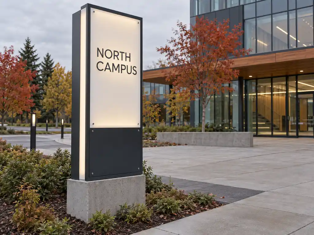
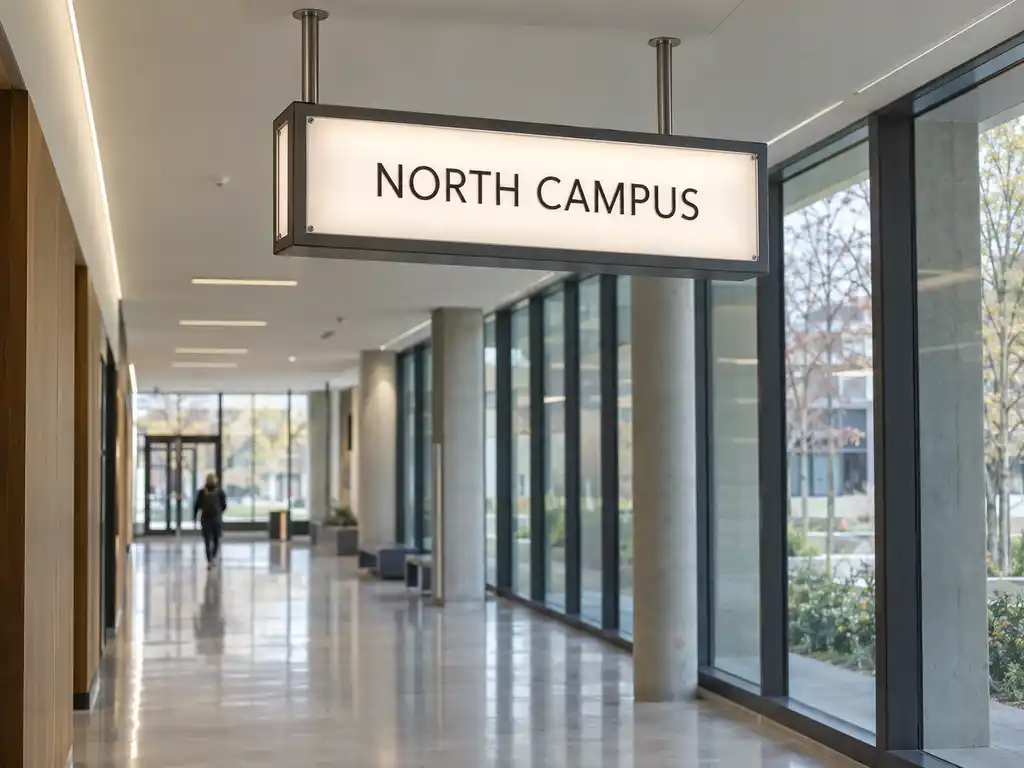
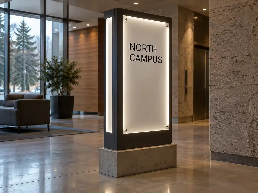
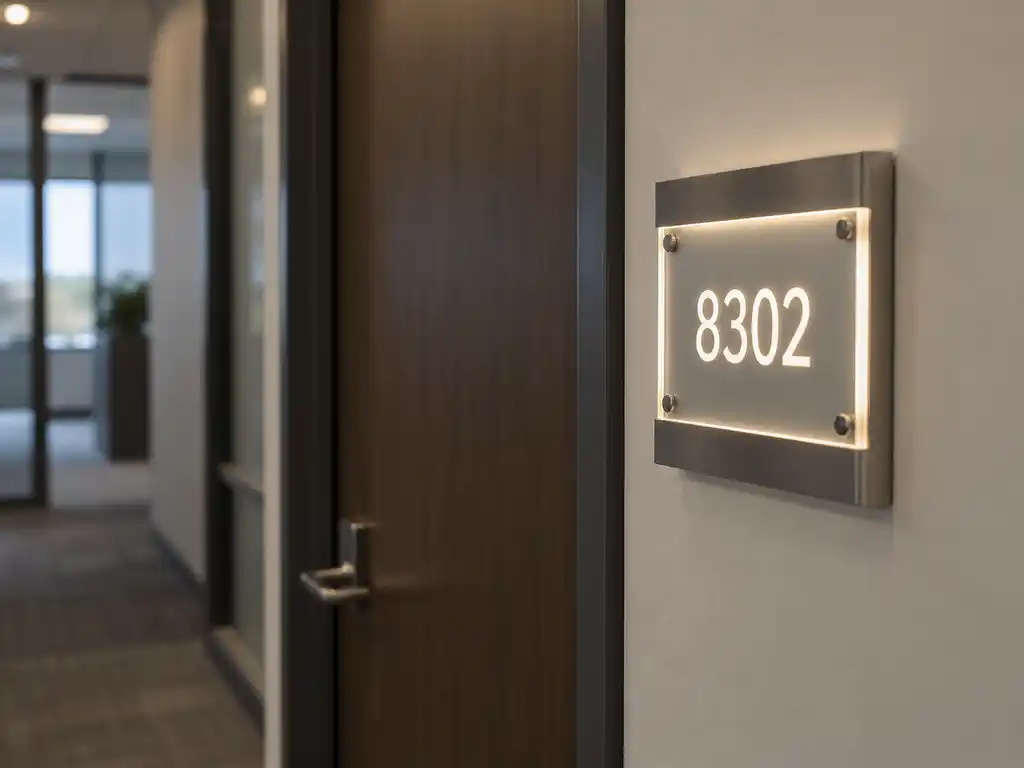
The brief was to replace that patchwork with one coordinated system: illuminated directional signposts at the campus gate and perimeter, low-profile directional block signs on the pedestrian routes between buildings, and backlit room number doorplates at every office door.
What we built
We produced the full set as one wayfinding family, so the arrow blades, the block signs and the doorplates share the same typeface, colour and light output no matter how each piece is mounted.
- Perimeter direction: aluminum + acrylic + LED illuminated directional signposts, with stacked arrow blades pointing to reception, parking and each building number
- Pedestrian routes: outdoor directional block signposts — multiple location arrows on a pole- or wall-mounted blade stack, dusk-to-dawn visibility
- Door level: backlit room number doorplates in stainless steel + acrylic + LED, vertical format with an integrated call button for meeting rooms
- Consistency: one arrow geometry, one panel depth and one LED colour temperature carried across all three product types
How the project ran
The client supplied a campus plan, a numbered list of destinations and a photograph of each mounting surface. From that we mapped which destinations belonged on the perimeter signposts, which belonged on the internal route signs, and returned scaled layouts for review before anything was cut.
The useful discipline on a campus is separating “where am I going” from “which door is this”. Directional blades carry destinations only, kept short enough to read from a moving car; doorplates carry room numbers only. Blending the two into single panels is what makes large-site signage feel cluttered — and it is why we kept the two families visually identical but functionally separate.
Delivery and installation
The sets were crated by building — Building A, Building B, and so on — so the installers unpacked one crate at one entrance instead of sorting a mixed shipment on site. Each pole signpost shipped with its mounting template, and each doorplate with a drilling template for the door frame. The campus facilities team handled the physical fit-out themselves, which kept site access and scheduling under their control.
Outcome
A visitor now follows one continuous line of sight — a lit signpost at the gate, a matching block sign along the walkway, and the same signage grammar again at the door. Because every part of the system was produced against a single set of files, the campus can add a new building or replace one damaged blade later without reopening the design.