The brief
A German railway station was running on signage that had been added a decade at a time. The waiting hall carried a mix of unlit printed boards and a few older light boxes, none of them speaking to each other, and platform-level direction had been handled with paper notices taped to columns whenever a sector split changed. Passengers arriving off a train and into the hall could find the exits, but they could not reliably find the right platform sector, the lifts, the service desk or the bus interchange — and the departure information that mattered most sat in panels too small and too dim to read from the middle of a busy concourse.
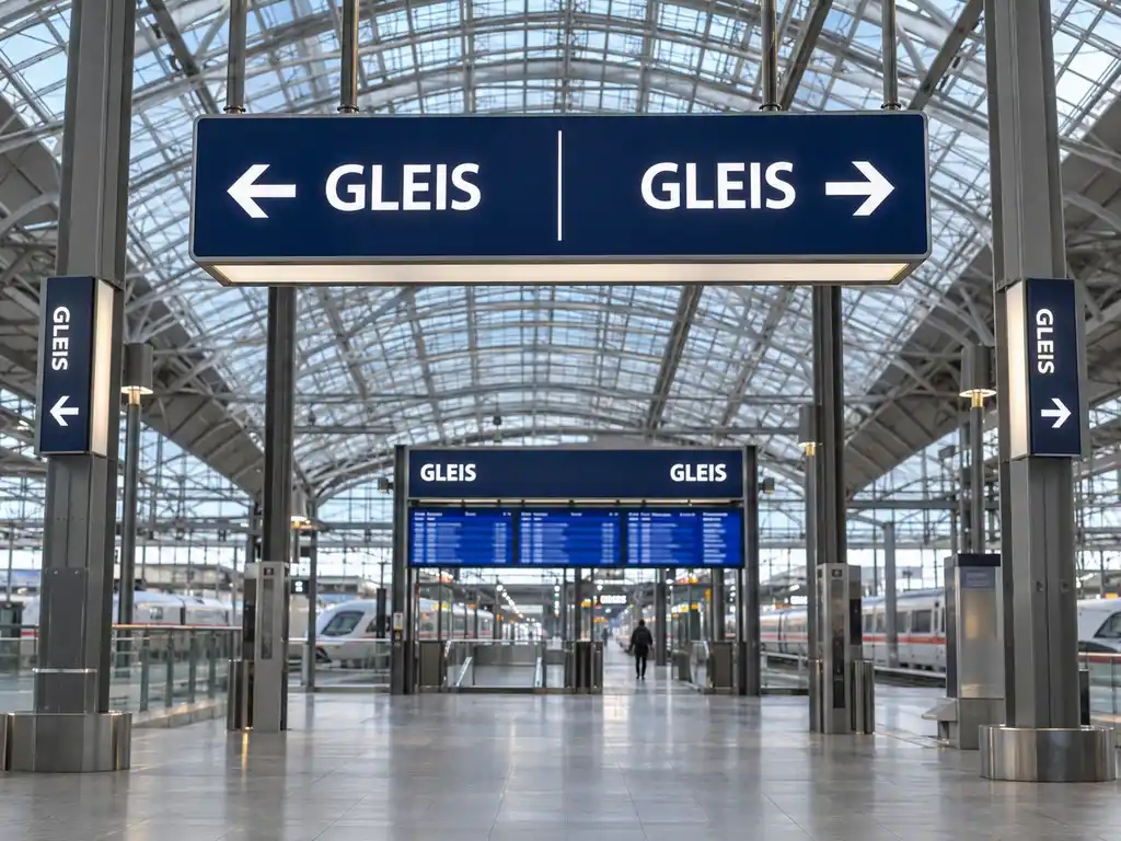
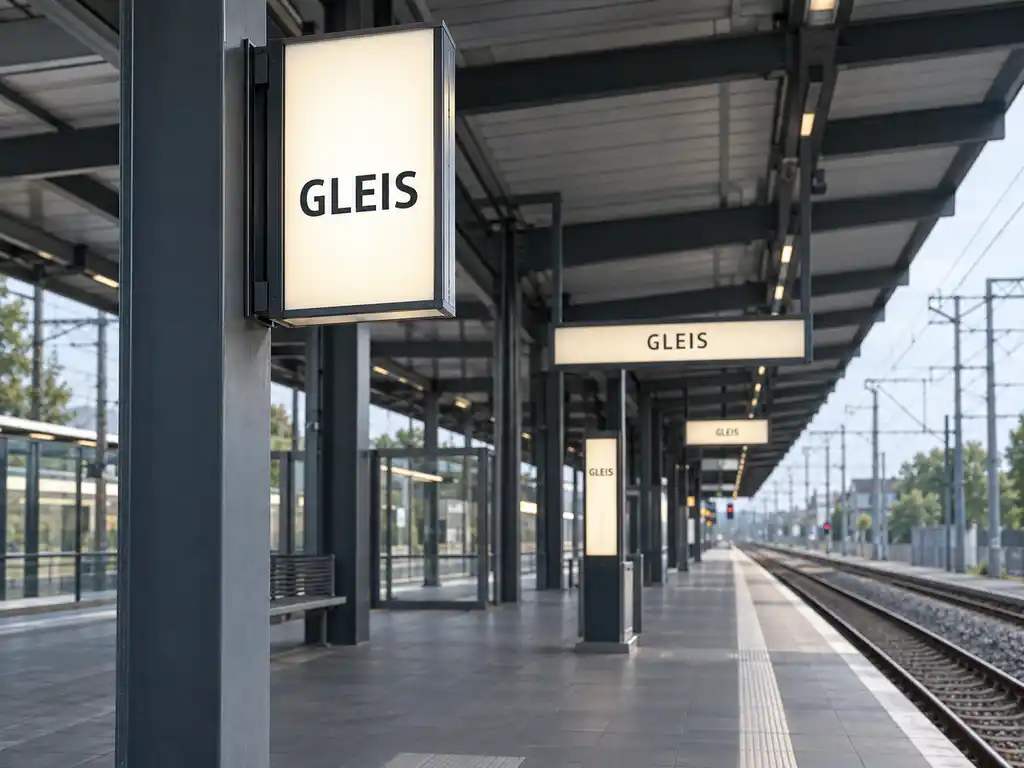
The brief was to rebuild the station’s passenger-facing wayfinding as one coordinated system: suspended signs hanging over the waiting hall at the points where people stop and look up, illuminated departure and platform-sector panels carrying a destination list that changes with the timetable, and projecting blades on the platform columns so a traveller walking a platform can read the sector before reaching it. Because this is a public transport building open from early morning until last service, everything had to work under mixed daylight and artificial light and stay legible at walking distance while carrying luggage.
What we built
We produced the sign types as one family, so a suspended hall sign, a departure panel and a platform blade share the same typeface, the same panel depth and the same light output — wherever they sit in the station.
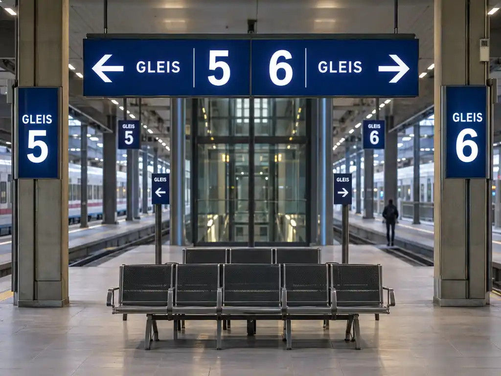
- Suspended hall signs: double-sided hanging light boxes — powder-coated aluminium frame + translucent polycarbonate faces + internal LED array, cable-suspended from the hall ceiling so the destination list is lit and readable from both directions at once
- Departure and sector panels: soft film light boxes — aluminium frame + stretch fabric (SEG) + LED, with a tool-free graphic replacement face so a line can be re-printed when the timetable or a sector split changes without dismantling the cabinet
- Platform column blades: circular projecting light boxes — steel + acrylic + LED on a wall-mount projecting arm, so the blade reads along the platform rather than across it
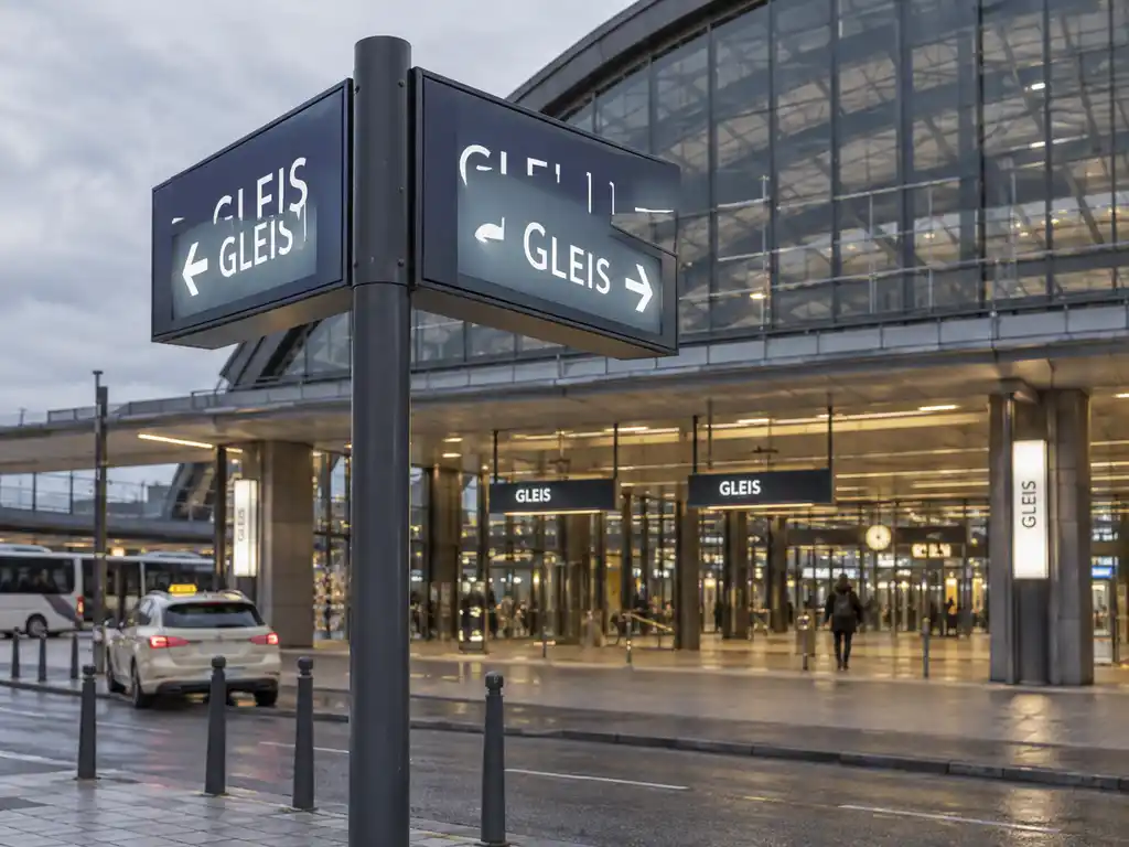
- Concourse and approach direction posts: illuminated directional signposts — aluminium + acrylic + LED, stacked arrow blades on a pole, lit for dusk-to-dawn visibility at the station entrance
- Consistency: one arrow geometry, one panel depth and one LED colour temperature carried across hall, platforms and approach
The suspended hall signs follow our double-sided hanging light box construction, the departure panels our soft film light box range and the platform blades our circular projecting light box, while the entrance posts are built from our illuminated directional signpost. The system as a whole follows the same approach we use for station, campus and public wayfinding. A single panel, a replacement face or a matching second unit can therefore be re-ordered against the same production files.
How the project ran
The station operator supplied three things: a plan of the waiting hall and platforms, the current platform and sector layout, and the list of destinations a passenger should be able to follow — platforms, sector letters, lifts, ticket and service desks, and the bus interchange. From that we mapped which destinations belonged overhead on the suspended hall signs, which belonged on the departure and sector panels, and which sat at column level along the platforms. Scaled layouts went back for review before anything was manufactured, which is also where the naming was settled: one level name, one spelling and one icon per facility across the whole station.
Two constraints shaped the detailing. The first is the signage logic passengers already know from German rail stations — destination-led arrows and platform sector letters arranged in a fixed information hierarchy — so we added nothing to the vocabulary a passenger has to learn. The second is the changing list: departure and sector panels are the one part of the system that goes out of date on its own, so those were built with replaceable faces rather than sealed graphics, and nothing else in the hall has to be touched when a panel is re-printed.
A sample face was produced first, so the operator could check colour, contrast and brightness against the hall’s existing lighting before the housings went into production. Panel spacing was set from the hall drawing rather than from the installed building, which matters where a concourse has been extended in phases and the ceilings are not at one level.
Delivery and installation
The order was crated by zone, so the waiting hall, each platform group and the station entrance arrived as their own sets rather than a mixed shipment. Every suspended sign shipped with its suspension template and wiring diagram, every panel with its 1:1 layout template and every blade with a mounting template for the column. The polycarbonate and fabric faces ship flat, which is also what lets the operator re-print a single departure listing later without re-ordering a whole cabinet.
The station’s own contractors handled the physical fit-out and the electrical connection, keeping track possession, after-hours working and building approvals under the operator’s control rather than ours. The suspended signs hang clear of head height under the hall ceiling and carry their own LED drivers, fed from the station supply, so a panel draws from the building rather than needing a separate lighting circuit on the concourse.
Outcome
A passenger now follows one continuous line: a lit suspended sign over the waiting hall, an illuminated departure and sector panel before the platform stairs, and the same signage grammar again on the column at the platform itself. Because every element was produced from one set of files, the operator can refresh a departure listing, add a newly opened platform sector or replace a single damaged blade without reopening the design — the cabinet stays, the graphic changes.