
The brief
A Canadian retail plaza and property developer was midway through a repositioning of one of its shopping plazas: new paving and landscaping at the entrance drive, one anchor unit re-split into smaller bays, and a refreshed tenant mix that had changed the tenant line-up on the sign long before anyone changed the sign. The entrance pylon was the last original element left on site — a 1980s cabinet with printed tenant panels behind a smoked acrylic face and two front-lit incandescent heads. Three of the panels named tenants that had already left, two more had been over-stickered by hand, and from the highway approach the whole face read as a patchwork.
The pedestrian entrance had a different problem. A low, unlit monument sign sat on a concrete plinth doing double duty as the plaza’s street address and its directory. It was unreadable from more than a few metres, invisible after dark, and the base was at the end of its structural life.
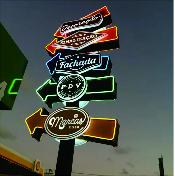
The brief was to replace both with one coordinated outdoor sign system: an entrance pylon built around a proper multi-tenant rent panel system the plaza manager could update without calling a sign contractor, and a stone-base monument sign that states the plaza identity at the sidewalk and separates “who is here” from “where do I go”.
What we built
We produced the pylon, the monument and the pedestrian direction signs as one family — one panel module, one typeface, one LED colour temperature — so a tenant panel on the pylon and a panel on the monument are physically interchangeable.
- Entrance pylon cabinet: 304 stainless steel light box construction — 304 stainless steel frame + LED + diffusion panel, with front-access panel replacement so a single tenant panel can be changed without dismantling the cabinet
- Tenant rent panels: frameless edge-lit light box inserts — brushed aluminum base + edge-lit LED array + UV-printed graphic film, zero visible frame on a 6mm edge profile, with a front-loading graphic change system
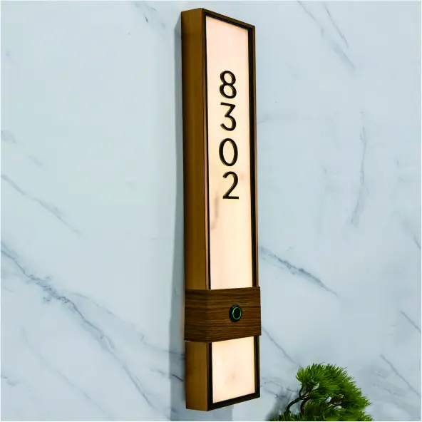
- Directory and plaza-map panel: ultra-thin light box — aluminum + light guide plate + LED, a slim 12mm edge-lit profile that keeps the illuminated face flat inside the shared panel module
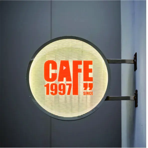
- Monument sign letters: large 3D outdoor site letters — aluminum + acrylic + LED, mounted to the plaza’s stone-clad base on concealed fixings
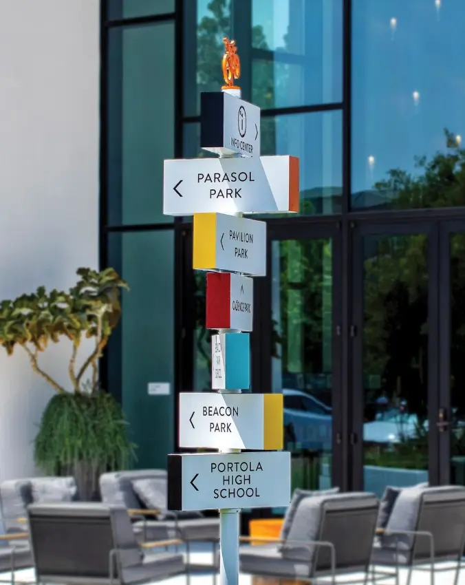
- Pedestrian direction signs: illuminated directional signpost — aluminum + acrylic + LED, vertical stacked directional blades on a pole mount, carrying parking, washroom and loading destinations
- Consistency: one panel module size, one arrow geometry and one warm-white LED colour temperature carried across the pylon, the monument and the direction signs
How the project ran
The plaza supplied a current tenant schedule, the unit numbers to be shown, survey drawings for the entrance island and the pedestrian approach, and the electrical service available at both locations. We surveyed the site first and measured the existing pylon cabinet and the monument plinth, because on a retrofit the foundation and the service rough-in are the fixed constraints — the new sign has to be built around what is already buried.
The first deliverable was a scaled elevation of each face with the panel grid drawn over it, so the developer could see how many tenant positions the pylon carries today and how many spare positions are held in the layout for bays that are still to be leased. That grid is the whole point of a rent panel system: every tenant occupies the same module, so the plaza manager swaps a printed insert instead of re-laying the face.
Because both the pylon and the monument sit in the municipal right-of-way at the entrance, the signage had to clear the local sign by-law on height, setback and illumination. We issued dimensioned elevation and foundation drawings in the format the developer’s permit consultant needed, and specified a dimmable LED driver so light output can be set back to whatever night-time illumination limit the by-law applies.
Delivery and installation
The pylon shipped as a knocked-down cabinet with its printed panels flat-packed separately, so no finished graphic was exposed in transit, and the monument letters shipped pre-fitted to a mounting rail. Every assembly arrived with its 1:1 layout template, wiring diagram and installation notes, together with the stud bolts, washers and nuts for the fixing points.
The developer’s own contractor handled the monument base, the pylon foundation and the electrical connection, keeping the entrance drive, working hours and landlord approvals under the developer’s control rather than ours. Installing in two phases — monument first, pylon second — kept one entrance lane open through the whole changeover.
Outcome
The plaza now has a single illuminated pylon carrying the full tenant line-up on one repeatable module, plus the spare positions already laid into the grid for the bays still to be leased. When a tenancy changes, the manager orders one printed insert and changes it in place from the front of the cabinet — no cabinet work, no scaffolding and no re-lay of the face.
At the sidewalk, the stone-base monument reads the plaza identity from a distance and carries the directory panel at eye level, with the same panel module the pylon uses. Presented as one family, the two signs finally look like they belong to the same property: brushed stainless steel and stone by day, an even warm-white glow after dark, and a legible tenant list at both entrances.