The brief
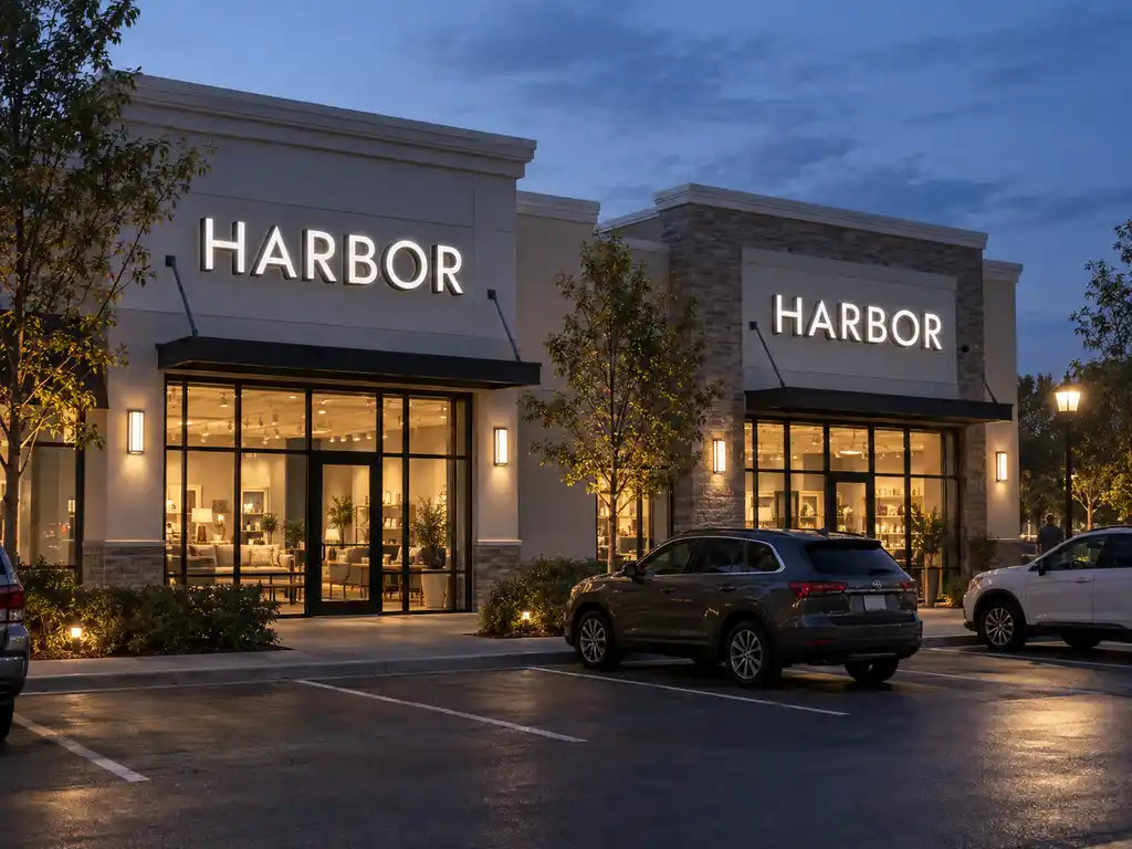
A multi-location retail operator needed a single illuminated-letter standard that could be rolled out across storefronts in several US states without the brand mark drifting between locations. The challenge was not the lettering itself — it was repeatability: identical colour temperature, identical stroke weight, identical mounting depth, store after store.
What we built
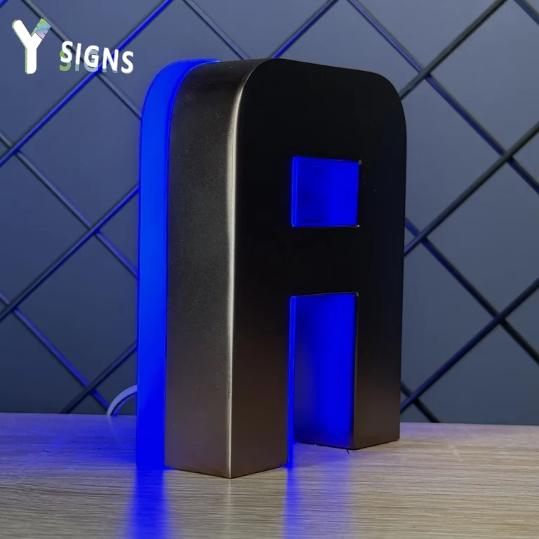
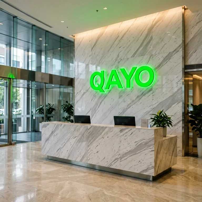
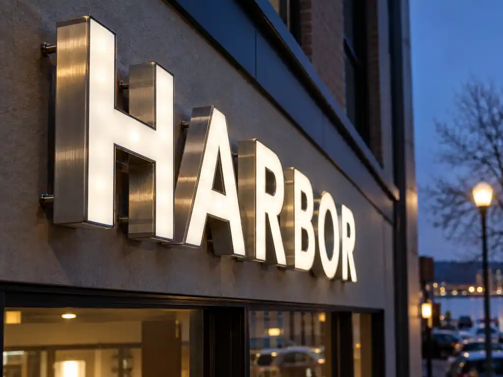
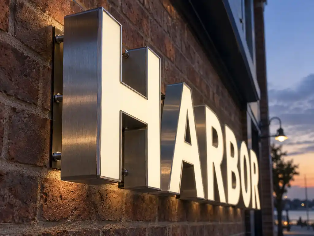
We produced front-lit channel letters on a brushed stainless steel return, with a translucent acrylic face matched to the client’s brand green. Every unit in the rollout shares one production file, one LED specification and one wiring diagram, so a replacement letter ordered a year later matches the original exactly.
- Letter construction: brushed stainless steel return, 90 mm depth, translucent acrylic face
- Illumination: front-lit, 6500K LED modules on MEAN WELL™ drivers
- Mounting: concealed raceway with 1:1 paper templates supplied per storefront
- Weatherproofing: IP65 rated for outdoor facade installation
How the project ran
Signage is a physical product, so the process is deliberately front-loaded. The client supplied vector artwork and a photograph of each storefront. We returned a scaled letter layout for approval, then produced a single prototype letter for sign-off on colour and brightness before committing the full rollout to production.
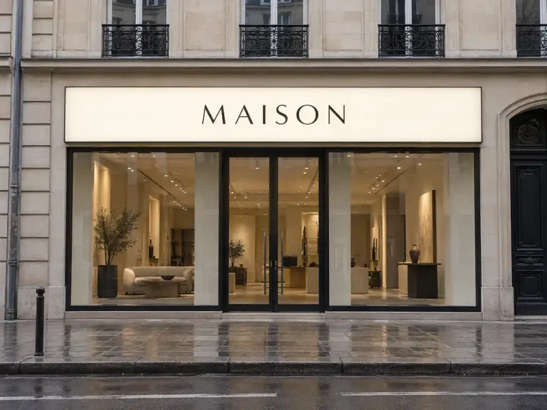
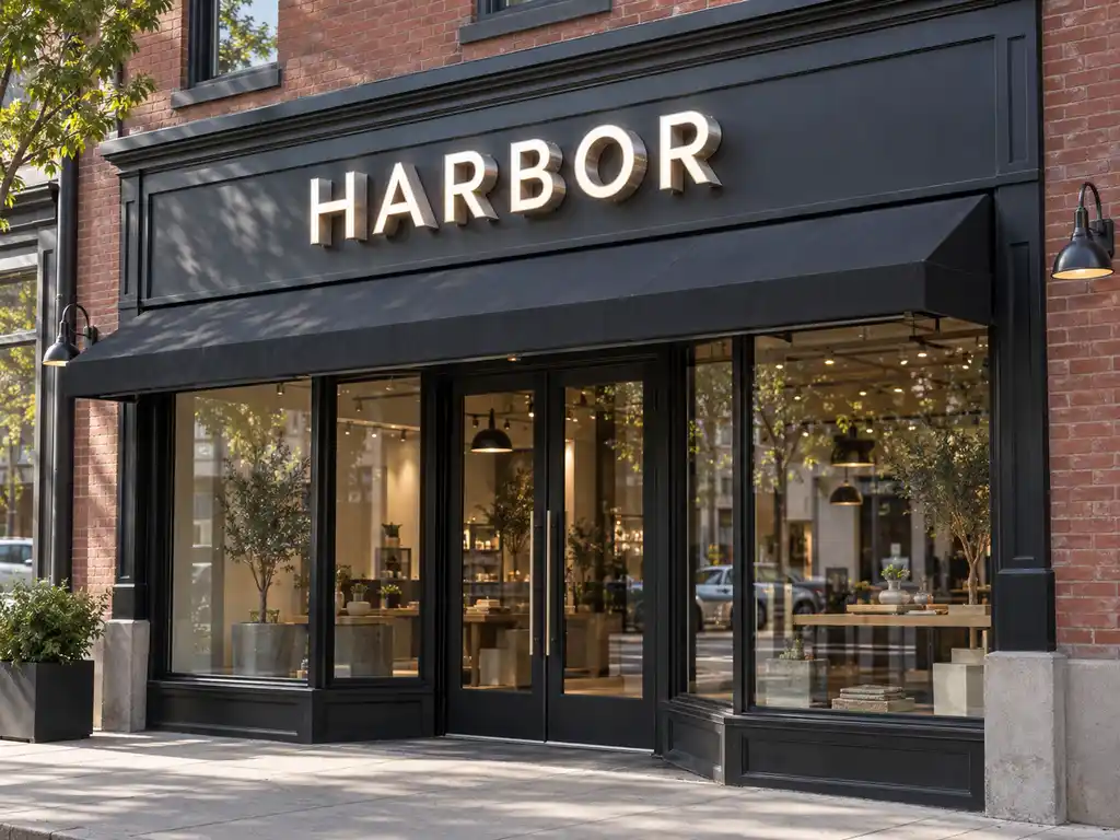
Because every storefront differed in width and fascia height, the letter heights varied slightly per location — but the typeface, stroke, depth and colour temperature never did. That is what keeps a chain looking like one brand.
Delivery and installation
The completed sets shipped via air freight with 1:1 mounting templates, wiring diagrams and installation notes packed with each crate. Local installers handled the physical fit-out, which kept the client’s own contractors in control of site access and scheduling.
Outcome
The operator now reorders individual letters and whole storefront sets against the same production files. New locations come online without a fresh design round, and the brand face stays consistent across the estate — which was the entire point of standardising the signage in the first place.