The brief
A luxury residential development in a Canadian suburban market needed a unified signage system across 48 homes and two communal areas. The developer’s constraint was that the signage had to reinforce the premium positioning of the development — the home number signs had to look like architectural elements rather than manufactured products. The community also needed a gateway sign at the entrance that would establish the development’s identity for visitors, and a directional sign for the pool area that would be visible from multiple approach angles.
What we built
We designed a three-component signage system that creates a continuous visual experience from the development entrance to each individual home:
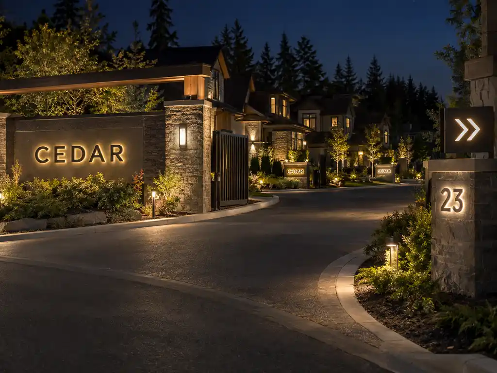
- Backlit stainless steel home number signs (48 units) — each home number is rendered in backlit stainless steel numerals mounted on a natural stone plinth. The numerals are illuminated with warm-white LED modules behind a diffuser panel, producing soft, even illumination that complements the warm lighting of the home’s interior. The stainless steel face has a satin finish that resists fingerprints and weathering. IP65-rated housing protects the LED and electrical components. The stone plinth material matches the existing development paving. Wiring is concealed within the plinth structure with a junction box at the base for service access.
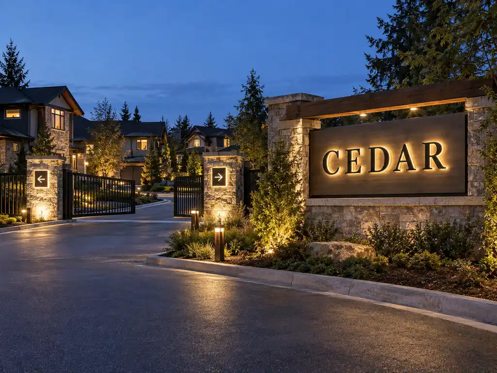
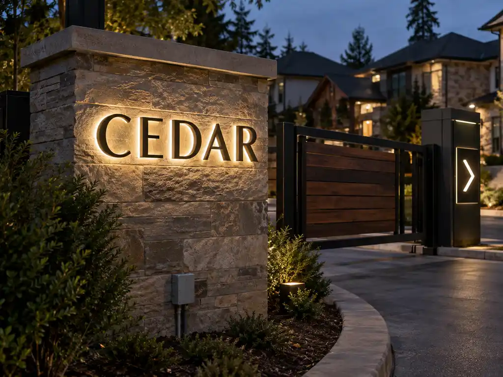
- Gateway sign (development entrance) — a composite backboard with halo-lit metal letters spelling CEDAR, mounted on a steel frame at the community entrance. The halo-lit effect is achieved by recessing LED modules behind each letter to create a soft wall-wash glow on the backboard. The composite backboard is powder-coated in a dark colour that contrasts with the warm LED glow. Directional arrows are integrated into the design to guide visitors towards the entrance gate.
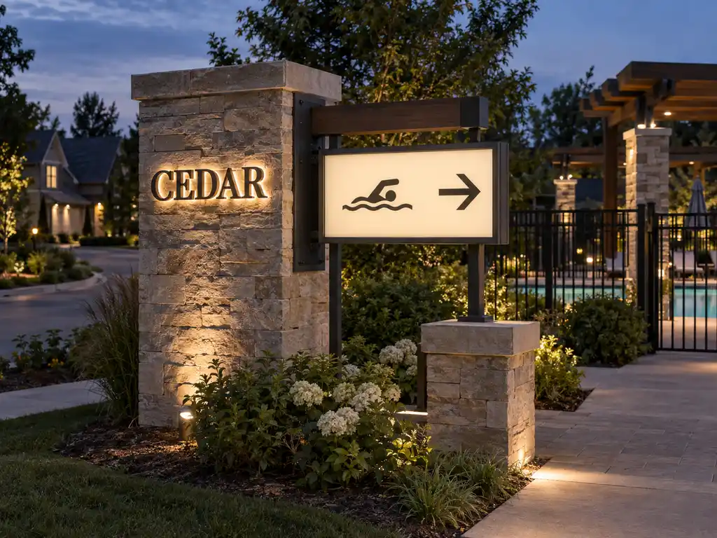
- Community pool area direction sign — a SEG (soft-edge light) light box with back-lit acrylic face, mounted on a steel post near the pool area entrance. The SEG format produces clean, soft edges with no harsh light bleed. Aluminium returns and trim cap frame the face. The sign is visible from the main drive and from the community path. IP65-rated housing for outdoor use.
All three components share a warm-white LED colour temperature and a consistent material palette — stainless steel, natural stone, and powder-coated aluminium — ensuring visual continuity across the entire development.
How the project ran
Phase 1 (design): we worked with the developer’s architect to ensure the signage materials and colours matched the development’s design palette. Home number sequences were confirmed against the development’s floor plan. Phase 2 (fabrication): all 48 home number signs, the gateway sign, and the pool area sign were fabricated in a single production run. Phase 3 (logistics): units were consolidated into 2 sea-freight containers, shipped to a Canadian regional distribution centre. Phase 4 (installation): local installation partners completed the work over 10 weeks, with home signs installed first to establish the visual language across the development, followed by the gateway sign to complete the entrance sequence.
Delivery and installation
Production lead time was 14 working days. Sea freight to Canada added 18 days. Installation across 48 homes and communal areas took 10 weeks. The project was completed and commissioned in 2025.
Outcome
The subdivision’s entry sequence now reads as one designed experience. The gateway sign establishes the development’s identity at the entrance, the home number signs maintain it at each door, and the pool area sign anchors the community space as a social landmark. Post-completion sales records show that the development’s premium positioning was reinforced — the signage contributed to the project achieving 100% pre-sales at a price point 15% above comparable developments in the same market. The developer has commissioned the same signage format for a second phase of the project.