The brief
A UK distillery & visitor attraction was opening a new visitor centre alongside its working production halls, on a site where the architecture deliberately leaves its industrial structure on show — brick, exposed steel, service runs and no attempt to dress the building up as anything other than a working distillery. The client needed one visual system to do three separate jobs at once: a name on the building that a coach party would recognise from the road, a way for visitors to find their own way around the tour route without a guide at every turn, and clear, durable signage through the production areas for staff, contractors and the occasional visitor who wanders where they should not be.
Because the site deliberately mixes public and working zones, the brief was as much about control as it was about appearance. The illuminated signage had to read from a distance outdoors, and it had to feel appropriate inside a building whose entire character is machine-age and unpolished — nothing chrome-flashy, nothing that would look like a shopping centre dropped into a nineteenth-century maltings.
A second constraint shaped the schedule. The visitor centre had a fixed opening date tied to a seasonal tourism window that could not move, so production and installation had to be planned backwards from that date rather than around a queue of orders.
What we built
We delivered the site as three coordinated packages: exterior building lettering, an interior wayfinding system, and a set of production-area safety signs.
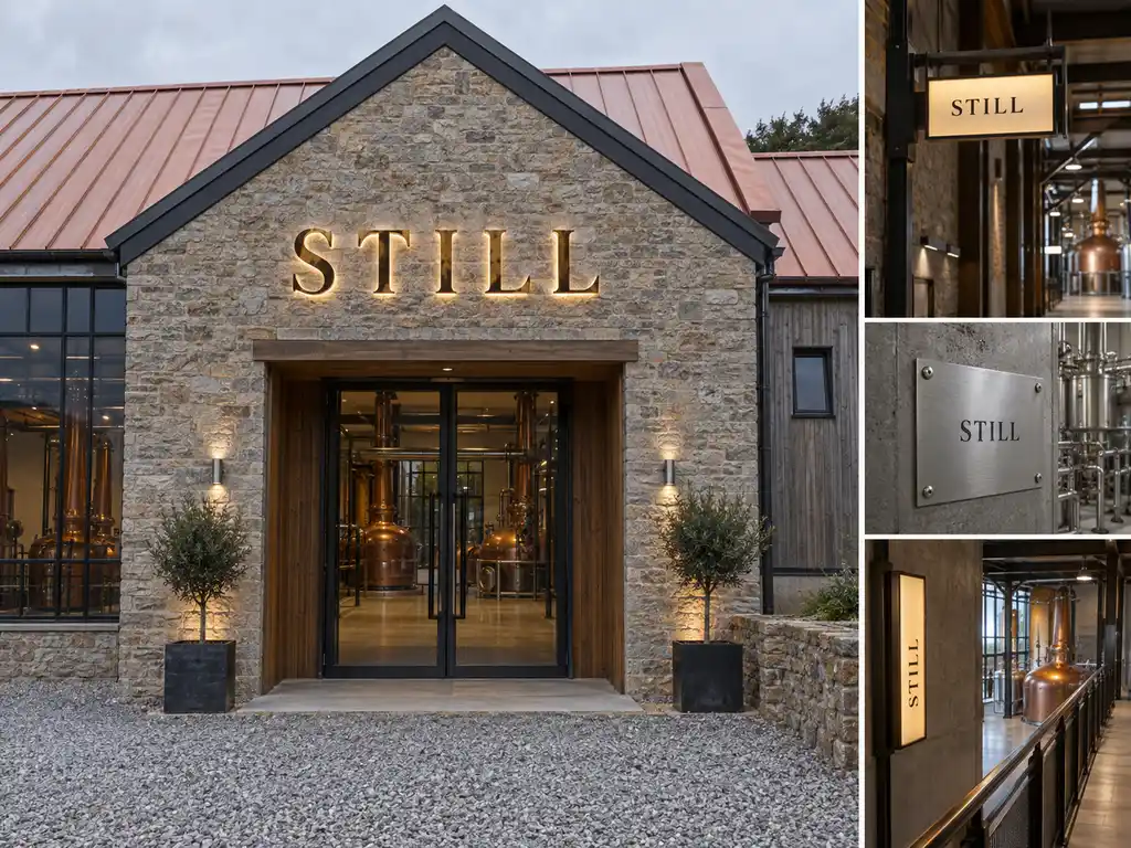
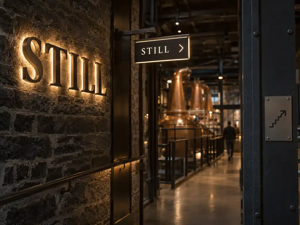
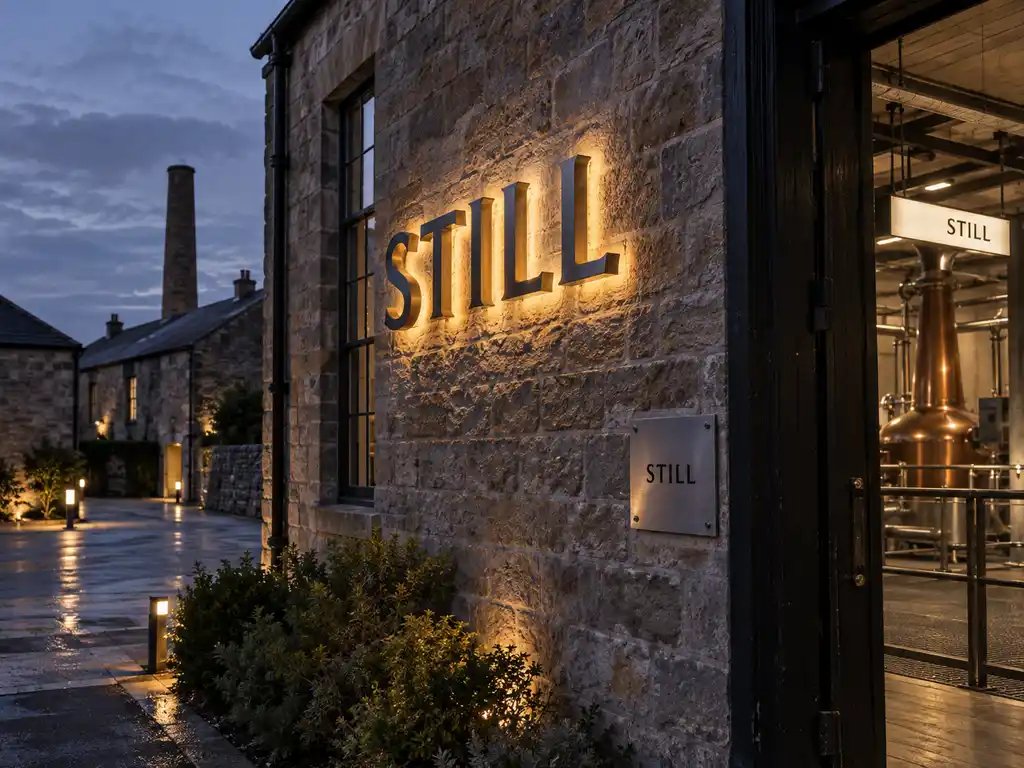
The exterior name was produced as back-lit letters on an electroplated stainless steel build, with the LED modules recessed behind each letter so the light washes the wall rather than the letter face. Fixed to brick and exposed steel, the effect is a restrained halo that keeps the lettering readable at night without looking like a light fitting bolted to a heritage elevation. The whole name was engineered as one matched group — a single stroke weight, a single stand-off depth and a single colour temperature — so the wall reads as one piece of illuminated typography rather than a row of separate signs.
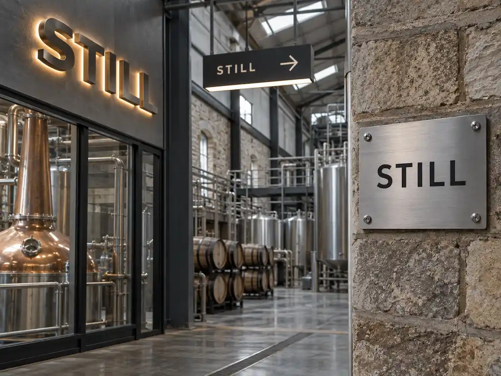
Inside, the visitor route is carried by illuminated directional signposts with stacked directional blades and arrow graphics, mounted along the tour and at the points where the public route meets a staff-only door. The production-area signage is deliberately unlit: solid stainless steel and aluminium lettering and plates chosen for a wash-down environment where printed vinyl and painted panels would not survive a year.
- Exterior lettering: stainless steel back-lit letters with an electroplated metallic finish and LED backlighting (matching catalogue specification: Stainless Steel + Electroplated Finish + LED Backlight)
- Finish: electroplated metallic finish — corrosion and weather resistant, specified for an elevation that takes a full UK coastal weather cycle
- Illumination: back-lit (halo) LED behind each letter, with LED modules rated at a 50,000+ hour service life and individually pre-wired so a single unit can be disconnected and replaced on its own mounting points
- Stand-off: concealed stand-offs hold each letter clear of the brick so the halo stays even along every stroke, with the depth set against the tone of the wall behind it
- Interior wayfinding: illuminated directional signposts with stacked directional blades and multi-directional arrows, built for dusk-to-dawn visibility along a naturally lit visitor route (matching catalogue specification: Aluminum + Acrylic + LED)
- Production-area safety signage: stainless steel and aluminium lettering and plates (matching catalogue specification: Stainless Steel / Aluminum) — strong corrosion resistance, easy to clean, and a durable metallic surface that stands up to a working plant
- Installation pack: 1:1 layout template, wiring diagram, installation notes, plus stud bolts, washers and nuts supplied with the sets
How the project ran
Signage is a physical product, so the process is deliberately front-loaded. The client supplied its name and wayfinding text as vector artwork together with elevations and photographs of the visitor centre wall, the tour route and the production halls, and rough dimensions of each. We returned scaled letter layouts drawn onto those photographs, showing stroke weight, letter spacing, stand-off depth and total wall width, and the client’s team signed that off before any metal was cut.
We then produced a single prototype letter so the client could judge the electroplated finish and the halo intensity against its own brickwork in daylight and at dusk — not against a photograph and not under our workshop lights. Only once the prototype was approved did the full set go into production. That sequencing matters on a building like this: the letters are fixed to a wall the client cannot easily rework after opening, so typeface, stroke weight, colour temperature and metal finish are all settled on the bench rather than on site.
The engineering question on the exterior was the stand-off depth. Too shallow and the halo collapses into a hard shadow line behind each letter; too deep and the letters look detached from the architecture. We settled the depth against the tone of the brick so the light reads as a soft wash behind the metal. In parallel, we issued the wiring diagram to the client’s contractor early enough for the supply route to be first-fixed into the elevation before it was closed up — the one part of the job that could not be revisited later.
The wayfinding package ran on a parallel track, because the tour route was still being finalised while the exterior letters were in production. We held the blade heights and mounting positions until the final route was confirmed, then produced the whole set in one matched batch so that every signpost on the route shares the same blade proportions, arrow graphic and light colour.
Delivery and installation
The completed signs shipped as crated sets via air freight, with the 1:1 mounting templates rolled separately so nothing was compressed against the finished faces in transit. Each letter and each blade was individually wrapped and labelled to its position on the wall, which meant nothing had to be re-identified on site.
The client’s own contractor handled the physical installation, working from our templates and wiring diagrams. Because the mounting points were pre-drilled and mapped to the template, the exterior was a matter of fixing the template to the elevation, drilling to the marked positions, hanging the letters in sequence and connecting each pre-wired unit back to its driver. The interior wayfinding followed the same procedure on a smaller footprint, and the production-area plates were a straight mechanical fix with no electrical work at all — so the crew did not have to learn three different installation methods for the three packages. Our team stayed available through the install window for dimension queries and photographs.
Outcome
The visitor centre now carries a solid-metal name on its building that reads as polished typography by day and glows softly across the brick after dark, without competing with the industrial character of the elevation. Visitors follow an illuminated route through the site instead of being handed a paper map at the door, and the line between the public tour and the working plant is marked by signage that is legible, permanent and appropriate to both.
Because every element was produced from one set of approved production files, the client holds a single specification for the whole site. Further tour stops, a second entrance or a later building can be quoted against that same file — same colour reference, same stand-off depth, same blade proportions — so the estate continues to read identically each time a sign is added instead of starting another design round.