The brief
A multi-tenancy medical centre in Australia had grown into a building it no longer explained. General practice suites, a pathology collection room, medical imaging, a pharmacy, a dental practice and allied health all sat under one roof, but the signage had been added tenancy by tenancy. The exterior carried flat, non-illuminated letters that disappeared after dark, and the entry carried a printed directory board that had been updated with stickers. A patient driving past could see the building but had no lit landmark telling them which door to use after hours, and referral patients sent for imaging or pathology routinely reached the front desk only to ask where to go next.
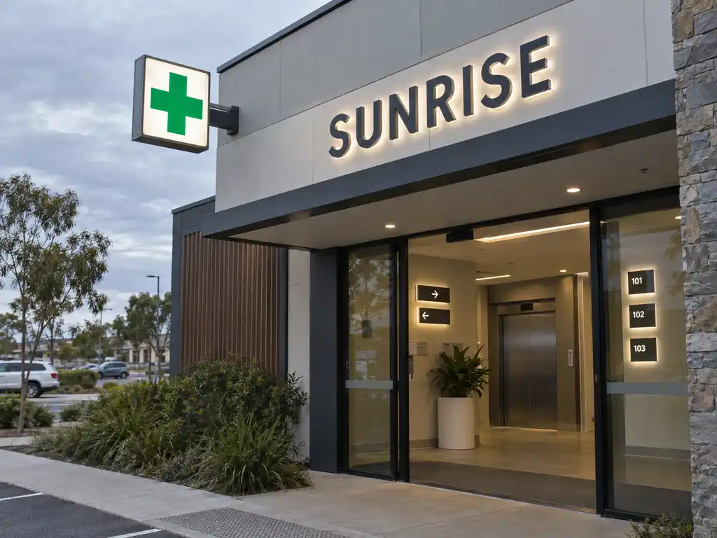
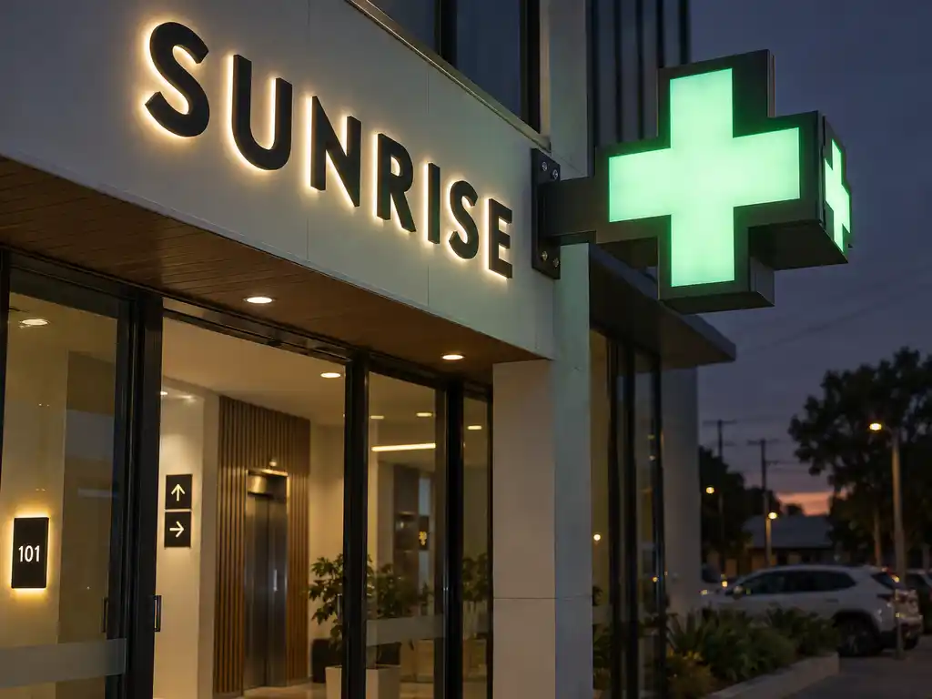
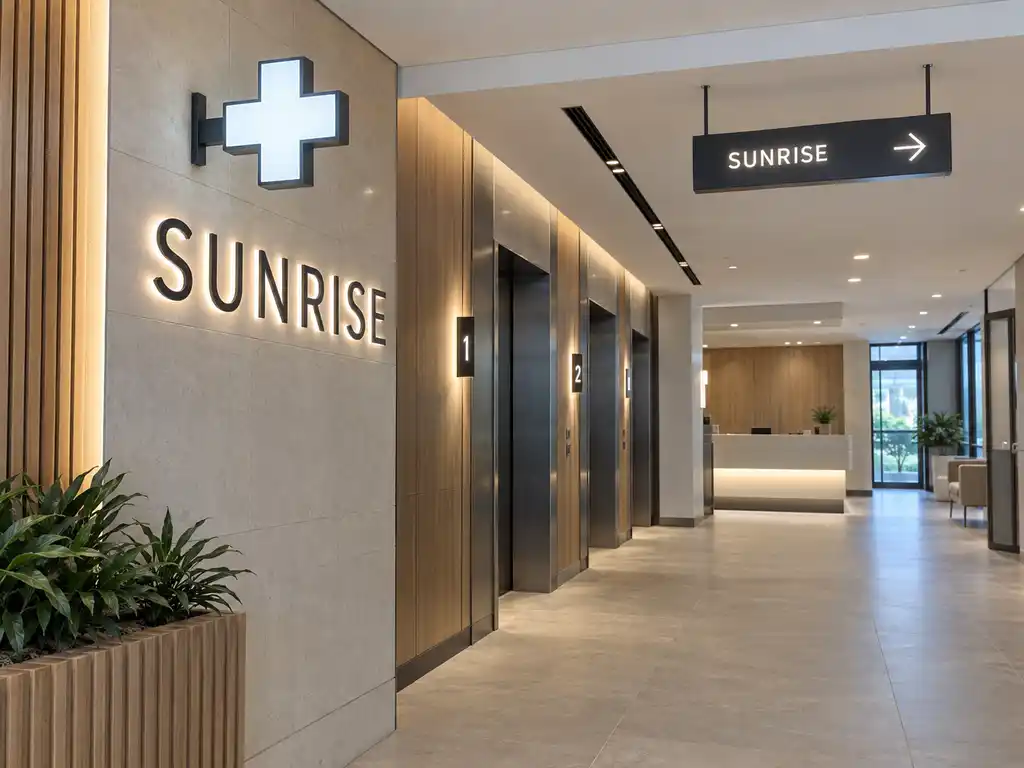
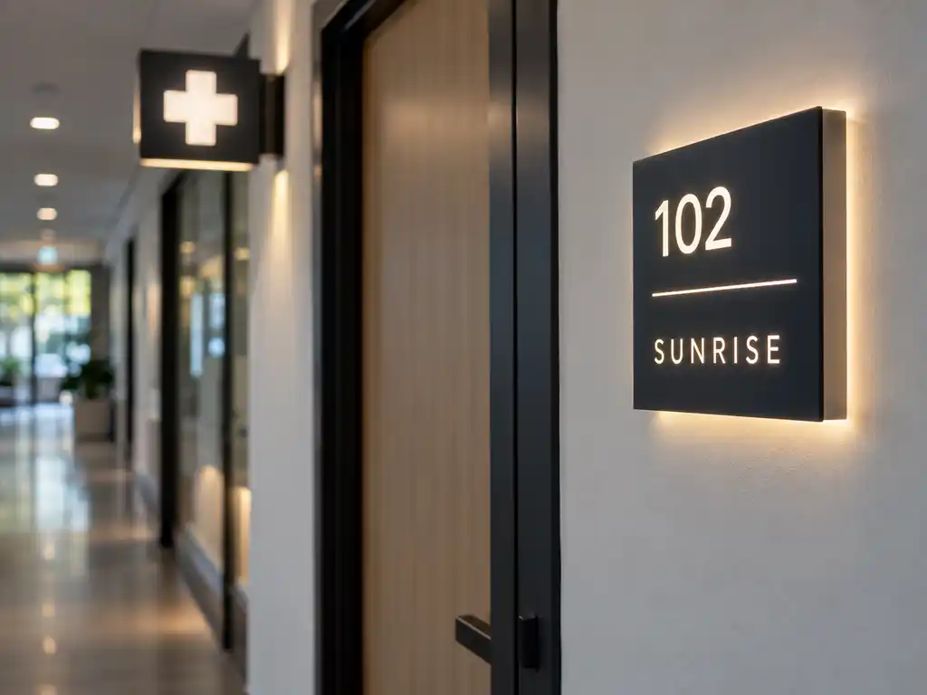
The brief was to rebuild that as one system: illuminated letters on the main entrance elevation that stay legible from the road at night, a universal medical cross on a projecting arm so the building is identifiable from both directions of the street, and an indoor wayfinding family — direction signs at the lift lobby and corridor junctions, and backlit identification at every consulting door. The exterior elements had to survive Australian conditions: long hours of direct UV, summer heat and driven rain. The interior set had to work for patients who are unwell, anxious, elderly or do not read English, which is where universal medical symbols earn their place.
What we built
The exterior and interior sets were produced as one family — the same typeface, the same panel depth and the same LED colour temperature on both sides of the glass, so the signage out on the street and the signage at the consulting room door still read as the same building.
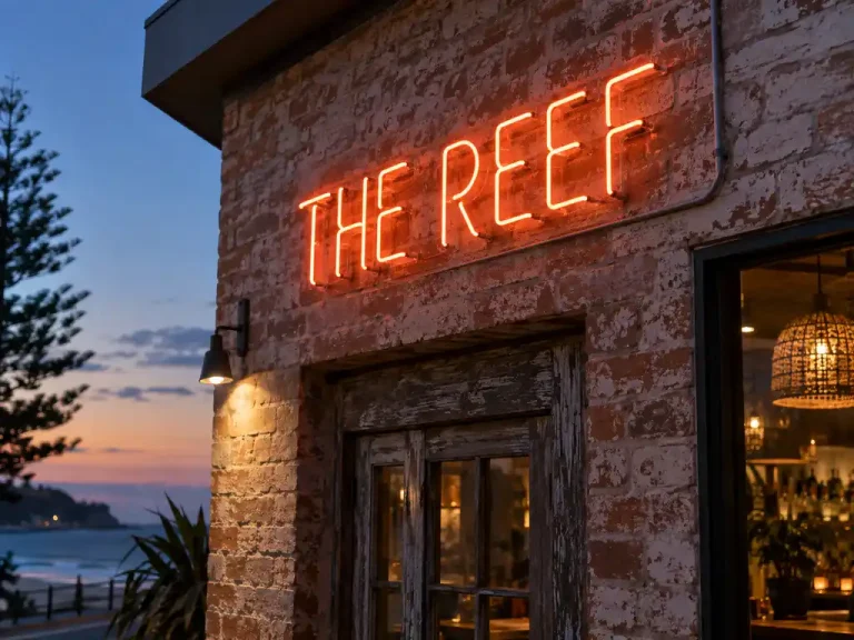
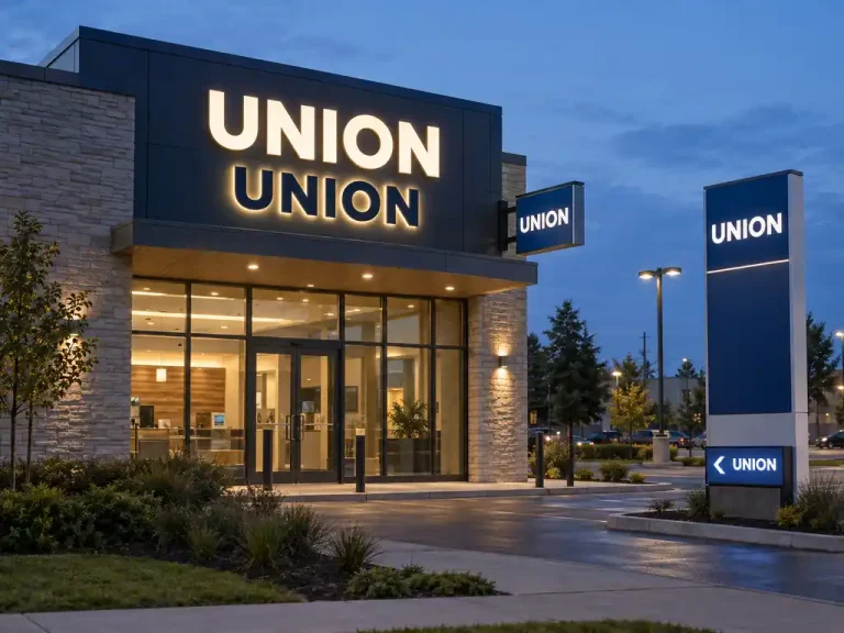
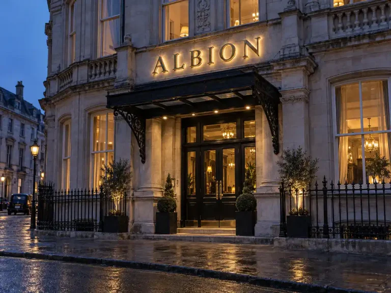
- Facade letters: backlit channel letters — stainless steel + acrylic + LED, uniform LED halo illumination behind stainless faces, custom sized per the entrance elevation
- Outdoor-rated letters: stainless steel back-lit letter signs — stainless steel + electroplated finish + LED backlight, corrosion and weather resistant for an exterior elevation in a coastal climate
- Universal medical cross: circular projecting light box sign — steel + acrylic + LED on a wall-mount projecting arm, double-sided so the cross reads along the street in both directions
- Interior wayfinding: illuminated directional signpost — aluminum + acrylic + LED, stacked directional blades for the lift lobby and corridor junctions
- Room identification: backlit room number doorplates — stainless steel + acrylic + LED, low-output backlighting at hand height on every consulting door
- Pictogram set: one symbol library drawn to one weight across every blade — first aid, pharmacy, pathology, imaging, accessible toilets and waiting — so a patient recognises a destination before reading it
How the project ran
The centre supplied an architectural floor plan, a current tenancy schedule and the destinations patients actually ask for: after-hours GP, pathology collection, imaging, pharmacy, dental and the accessible entry. From that we separated “where am I going” from “what happens on this floor”. Direction blades carry destinations only, short enough to read while walking. The printed listing stays on the directory at the entry and nowhere else, because mixing the two is what makes healthcare signage feel crowded.
The lighting levels were set deliberately unequal. The facade letters and the cross run at full output because they compete with street lighting and a bright retail frontage next door. Interior blades run at a fraction of that so they guide rather than glare in a clinical corridor, and the doorplates are lit only enough to make a room number readable at hand height — a patient standing at a door should not be looking at a light source.
Room numbering and level naming were settled before anything was cut, so the centre could not end up with one consulting corridor numbered 1–8 and the next lettered A–H. Scaled layouts went back for review, then 1:1 paper templates confirmed the physical positions of the facade letters against the actual brick coursing and the cross against the projecting soffit. The pictograms were drawn as a set rather than lifted individually from a generic icon library, so stroke weight, corner radius and head shapes stay consistent from the street sign to the toilet door.
Delivery and installation
The order was crated by zone: the entrance elevation as one set, then the lift lobby, each consulting corridor and the tenancy doors. Every exterior letter shipped with its 1:1 layout template, wiring diagram and installation notes, plus stud bolts, washers and nuts. Exterior work was scheduled outside the centre’s peak consulting hours, and the interior was phased corridor by corridor so the practice could keep seeing patients while the signage went up.
The centre’s own electrical contractor made the final connections, keeping site access, isolation and compliance sign-off under the centre’s control. Because the tenancy fit-out had moved two consulting rooms during the build, the numbering was re-surveyed on site before the doorplates were cut — cheaper than re-cutting a corridor of plates after handover.
Outcome
The building now explains itself in one continuous line: a lit cross visible from either direction of the street, illuminated letters over the correct entrance, blades at the lift lobby, and a lit number on the door the patient was actually sent to. After-hours arrivals no longer test door handles to find the open one, and front-desk staff spend less of the day redirecting people who were sent for pathology or imaging.
Because every part of the system came out of one set of files, the centre can re-cut a single blade when a tenancy changes, replace one damaged facade letter, or add a new consulting door number without reopening the design — the family stays, the individual sign changes.