The brief
A public library & cultural centre in Canada was completing a new wing and a rebuilt front entrance. The building sits on a civic lot shared with a municipal service counter, so the entrance has to be findable from the street, from the parking court and from the pedestrian path that runs along the property line. The centre had no exterior identity on the building at all: the doors are set back under a canopy, and from the road the building read as an unmarked civic block.
Three constraints shaped the work. The centre operates in a bilingual province, where English and French carry equal status on public-facing signage, so both language lines had to be set at the same cap height rather than one being reduced to fit underneath the other. A public institution also reads differently from a retail storefront: the signage has to mark a civic entrance and stay legible without turning the forecourt into an advertising surface, and nothing may crowd the accessibility paths in front of the doors. And the Canadian year means the sign is read in low winter sun, in snow glare and through long dark hours, so the daylight and after-dark views both had to be designed, not just the illuminated one.
What we built
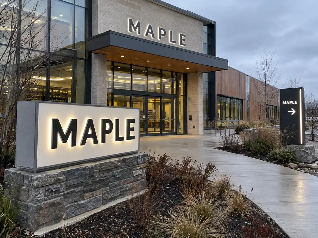
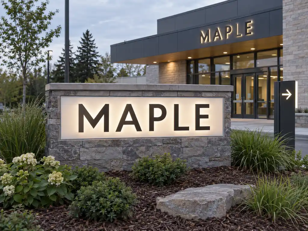
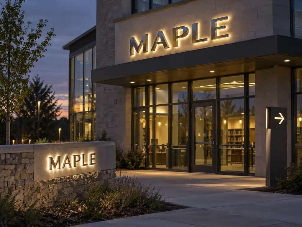
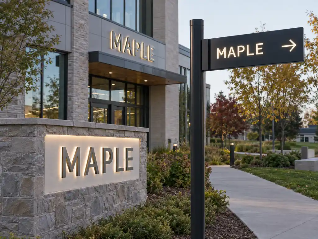
We delivered a three-part exterior system produced from one approved bilingual layout: a stone-base entrance monument carrying the centre’s name in two languages, halo-lit stainless steel letters above the main entrance, and an illuminated wayfinding blade pointing to the library entrance, the cultural hall and accessible parking. All three use the same typeface, the same return depth and the same warm LED colour temperature, so the monument, the facade and the walkway blade read as one civic identity from the street.
- Entrance monument: the centre’s name set in large-format three-dimensional letters on a stone-faced plinth — solid letterforms that stay legible in silhouette against the sky, with the return depth chosen so the letters throw a clean shadow line in low winter sun instead of flattening out into the base
- Bilingual name line: English and French set at the same cap height in two stacked lines, with the French diacritics cut as part of the letterforms rather than applied as overlays that lift at the edges through freeze-thaw cycles
- Facade lettering: electroplated stainless steel back-lit letters over the main entrance, so the name reads as solid brushed metal in daylight and as a soft warm halo after dark, with no light source visible from the forecourt
- Stone base: a clad plinth proportioned to the bylaw envelope on that frontage, with a concealed structural frame, drainage at the base of the stone and a foundation detail that keeps salt and meltwater away from the letter returns
- Illuminated faces: sandwich luminous construction on the monument’s readable faces — aluminium composite back panel, LED matrix and a high-diffusion front layer in a slim profile, which is what produces even panel light with no hot spots or visible modules
- Wayfinding blade: a pole-mounted illuminated directional signpost carrying stacked arrow blades to the library entrance, the cultural hall and accessible parking, dusk-to-dawn illuminated and kept visually identical to the monument so the two do not read as separate sign schemes
- Illumination: externally accessible LED modules and drivers inside sealed housings, so a module or a driver can be swapped from the face side without dismantling the monument or the blade
- Winter performance: sealed faces, electroplated and anodised surfaces and no upward-facing light spill, so the signage does not throw snow glare back at the reader and does not need re-polishing after every winter
The monument letters come from our large 3D outdoor site letters range; the entrance line is built on our electroplated back-lit letter range; the monument body combines a stainless steel light box frame with sandwich luminous faces; and the walkway blade comes from our illuminated directional signpost range. Because all of them are standard ranges, a replacement letter, a new blade or a spare face panel later re-orders against the same production file.
How the project ran
The centre supplied its architectural elevations, the bylaw envelope for the frontage, the exact spelling and accents of both language lines, and the layout of the accessible path and parking. We returned scaled layouts showing the monument sized against the permitted height and setback, the facade letters positioned against the canopy joints and the panel module, the wayfinding blade set at a height that clears the walking route, and both language lines proofed at equal cap height.
The bilingual layout is where most public signage goes wrong. The usual shortcut is to set the English line large and drop the French line underneath in a smaller size, which is immediately readable as a hierarchy nobody intended. We proofed both lines at the same height, adjusted only the tracking to balance the two line lengths, and confirmed the diacritics — the accents on the French characters — as cut letterforms rather than applied overlays. On the wayfinding blade we kept each message to a single destination: the library entrance, the cultural hall, accessible parking. Anything further competes with the arrow at the distance the blade is actually read from.
Once the layout was approved we produced one finished monument letter and one facade letter as physical samples, so the centre could check the finish, the stone tone and the light temperature in daylight and after dark before the full set went into production. The remaining letters, the monument faces and the blade were then finished in one batch, which keeps the plating tone and the LED colour consistent between the forecourt, the entrance and the walkway.
Because the centre is an occupied building with public program hours, the installation window was fixed months ahead: the monument footing and the pole sleeve had to be in the ground before the ground froze, and the facade letters had to go up without closing the entrance for a full day. Working from the approved elevation rather than a site survey meant the electrical contractor needed the templates and the connection points only.
Delivery and installation
The set shipped in three crates — monument letters and mounting hardware in one, facade letters with their templates in the second, pole, blade set and sleeve in the third — each with a 1:1 paper template, a wiring diagram and the bolts, spacers and washers for the concealed fixings. The stone cladding was cut to the approved plinth dimensions so the mason could clad the base while the letters were still in transit, which kept the critical path to a single site visit per elevation.
For Canada we supply shop-style dimensioned layouts and material, finish and illumination notes in the format the local contractor submits for the sign permit, and confirm the applicable electrical and structural requirements with that contractor before production. The monument frame shipped with an adjustable levelling detail so the plinth could be set true on the poured footing, and the facade letters were drilled and bracketed to match the canopy elevation so the wall was opened once.
The install fell inside a cold snap, so the letters and the plinth cladding were staged indoors and set in place over two days, with the sealant and the final connections made in one continuous run. No element needed on-site fabrication, which is what kept the entrance usable through the whole installation.
Outcome
The centre now has one exterior identity that works at every distance it is read from. From the road and the parking court the monument identifies the building before a visitor reaches the door; at the entrance the halo-lit metal letters locate the opening after dark without washing light across the forecourt or the neighbouring municipal windows; along the walkway the illuminated blade separates the library entrance, the cultural hall and accessible parking, so a first-time visitor does not have to read a directory panel at the door. Both language lines carry the same weight, so neither reads as an afterthought to the community it serves.
Because the monument, the facade lettering and the wayfinding blade were all produced from one approved file, the centre can add a second entrance, replace a single letter or reissue a blade later against the same standard instead of commissioning a fresh design round — which matters for a civic facility that expects its identity to outlast several rounds of building work.