The 1-Inch Rule: How to Calculate the Right Letter Size
One of the most common questions we receive from business owners is: “How big should my channel letters be?” The answer depends on one fundamental rule of signage design: for every inch of letter height, you can read the sign from approximately 10 feet away.
This simple formula — known as the 1-inch-to-10-feet rule — is the industry standard for determining optimal letter size based on viewing distance. But real-world application requires understanding several additional factors that affect readability.
In this guide, we’ll walk through exactly how to calculate the right letter size for your business sign, including practical examples, exceptions to the rule, and tools to help you make the best decision for your specific situation.
Understanding the Readability Formula
The readability formula is deceptively simple:
Letter Height (inches) = Viewing Distance (feet) ÷ 10
Or rearranged:
Reading Distance (feet) = Letter Height (inches) × 10
Let’s break down what this means in practice:
- A 3-inch letter is comfortably readable from about 30 feet away
- A 6-inch letter can be read from approximately 60 feet away
- A 12-inch letter is visible from roughly 120 feet away
- A 24-inch letter can be read from about 240 feet away
While this formula gives you a starting point, several factors can modify the optimal size for your specific application.
Reading Distance vs. Comfortable Distance
It’s important to distinguish between two types of reading distance:
Maximum Readable Distance
This is the farthest distance at which a person with 20/20 vision can just barely decipher the letters. Under ideal conditions (good lighting, high contrast, no obstructions), the 1-inch-to-10-feet rule applies directly.
Comfortable Reading Distance
This is the distance at which readers can process the text without strain. For comfortable reading, multiply the letter height by 5-7 instead of 10. So a 6-inch letter provides comfortable reading from 30-42 feet, rather than the maximum 60 feet.
Practical implication: If you want your sign to be readable at a comfortable level from 50 feet away, you’d need letters at least 7-10 inches tall, not just 5 inches.
Factors That Affect Letter Size Requirements
Beyond the basic formula, consider these factors that influence optimal letter size:
Viewing Speed
The faster your audience is moving, the larger your letters need to be:
- Walking speed (3 mph): Standard 1-inch-per-10-feet rule applies
- Biking speed (10-15 mph): Increase letter size by 50% for comfortable reading
- Driving speed (25-35 mph): Letters should be 2-3x larger than walking-distance calculations suggest
For example, a sign meant to be read by drivers on a local street (25 mph) should use letters approximately 2 inches tall for every 10 feet of viewing distance — double the standard rule.
Contrast and Lighting
High-contrast signs (dark letters on light background, or illuminated letters against dark facade) are more readable at greater distances. Low-contrast signs may need larger letters to compensate.
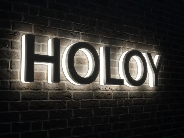
Halo-lit channel letters against a dark brick wall create excellent contrast and maximize readability beyond the basic formula.
Letter Style and Complexity
Simple, bold fonts with thick strokes are more readable at smaller sizes than delicate script fonts or letters with many thin details. When choosing letter size, factor in your typography choice:
- Sans-serif fonts (Helvetica, Arial): Most readable at smaller sizes
- Serif fonts (Times New Roman, Garamond): Require slightly larger sizes for equivalent readability
- Script/custom fonts: Need the largest sizes due to thinner strokes and potential detail loss
Environmental Conditions
Fog, rain, glare, and ambient light pollution can reduce readability. If your sign will be viewed in challenging conditions, err on the side of larger letters.
Letter Size Chart for Common Applications
| Application | Typical Viewing Distance | Recommended Letter Height | Example |
|---|---|---|---|
| Indoor lobby sign | 10-20 feet | 1-2 inches | Office suite numbering |
| Storefront window | 15-30 feet | 2-4 inches | Boutique name on glass |
| Retail storefront facade | 30-60 feet | 4-8 inches | Shop name above entrance |
| Strip mall facade | 50-100 feet | 6-12 inches | Business identification |
| Freestanding monument sign | 100-200 feet | 12-24 inches | Shopping center directory |
| Building rooftop sign | 500+ feet | 36-72+ inches | Corporate branding |
Width-to-Height Ratio Considerations
Once you’ve determined the optimal letter height, you’ll need to decide on letter width. The width affects both aesthetics and readability:
- Narrow letters (width ≈ 60-70% of height): Look elegant but may reduce readability at distance
- Standard letters (width ≈ 75-85% of height): Balanced appearance and readability
- Wide letters (width ≈ 90-100% of height): Maximum impact and visibility
For signs where maximum readability is the priority (high-traffic locations, fast-moving viewers), wider letters are preferable. For decorative or interior applications, narrower proportions may be more aesthetically pleasing.
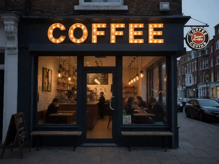
Case Study: Choosing Letter Size for a Coffee Shop
Let’s work through a real example. A coffee shop owner wants to install illuminated channel letters on their storefront:
Scenario details:
- Storefront faces a parking lot with pedestrian traffic
- Primary viewing distance: approximately 40 feet (from parking area)
- Secondary viewing distance: 80-100 feet (from adjacent street)
- Brand aesthetic: modern, clean, premium
Calculation:
- For 40-foot comfortable reading: 40 ÷ 5 = 8-inch letters minimum
- For 80-foot maximum reading: 80 ÷ 10 = 8-inch letters minimum
- Recommended size: 8-10 inch letters for optimal balance
The coffee shop chose 9-inch tall letters in a clean sans-serif font with halo-lit backlighting. The result: excellent visibility from both the parking area and the street, with an elegant aesthetic that matches their brand positioning.
Tools for Determining Letter Size
DIY Paper Template Method
Before finalizing your sign design, create a paper template of your proposed letter size and hold it up at your storefront. Step back to your typical viewing distance and assess readability. This simple test reveals whether your chosen size works in practice.
Online Letter Size Calculators
Several signage industry websites offer letter size calculators based on the 1-inch-to-10-feet formula. While helpful for initial estimates, always verify with physical mockups for critical installations.
Professional Design Consultation
Our design team at Y SIGNS LED can help determine optimal letter sizes for your specific application. We consider viewing distance, environmental factors, brand aesthetics, and budget to recommend the best solution for your business.
Common Letter Size Mistakes to Avoid
- Going too small to save money: Undersized letters compromise readability and waste your investment. A sign that can’t be read from the intended distance provides little value.
- Ignoring viewing speed: Signs meant for high-traffic streets need larger letters than those for quiet residential areas.
- Not accounting for font complexity: Ornate scripts require larger sizes than simple block letters for equivalent readability.
- Overlooking contrast: Light letters on light backgrounds or dark on dark require larger sizes than high-contrast combinations.
- Forgetting about future expansion: If you plan to add text below your main sign, ensure the letter height allows for proper visual hierarchy.
Related Resources
For more guidance on channel letter design and installation:
- Channel Letter Size and Font Guide: How to Pick the Right Letter Height — Comprehensive coverage of sizing principles
- Channel Letter Mounting and Installation Guide — Learn about mounting options that affect perceived size
- Channel Letter Cost Guide 2026 — Understand pricing factors related to letter size
Need Help Determining the Right Letter Size?
Our signage experts are ready to help you choose the perfect letter size for your business. Whether you’re installing your first sign or replacing an outdated one, we’ll ensure your channel letters are sized for maximum impact and readability.