Why Letter Size Matters
Your channel letters are the first thing potential customers see—often from a moving vehicle or across a parking lot. Letter height isn’t just an aesthetic choice; it determines whether your sign works or wastes money. Industry research shows that 70% of consumer decisions happen within 7 seconds of seeing a storefront sign, making proper letter sizing a direct driver of foot traffic and brand recall.
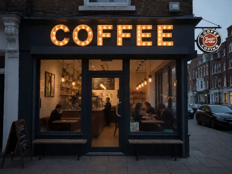
Letters that are too small disappear into the background, especially at night when illuminated channel letters rely on contrast against the building facade. Letters that are too large overwhelm the storefront, compete with windows and doors, and may violate local sign codes. Finding the right channel letter height balances visibility, aesthetics, and compliance—and it all starts with understanding viewing distance.
Letter Height vs. Viewing Distance
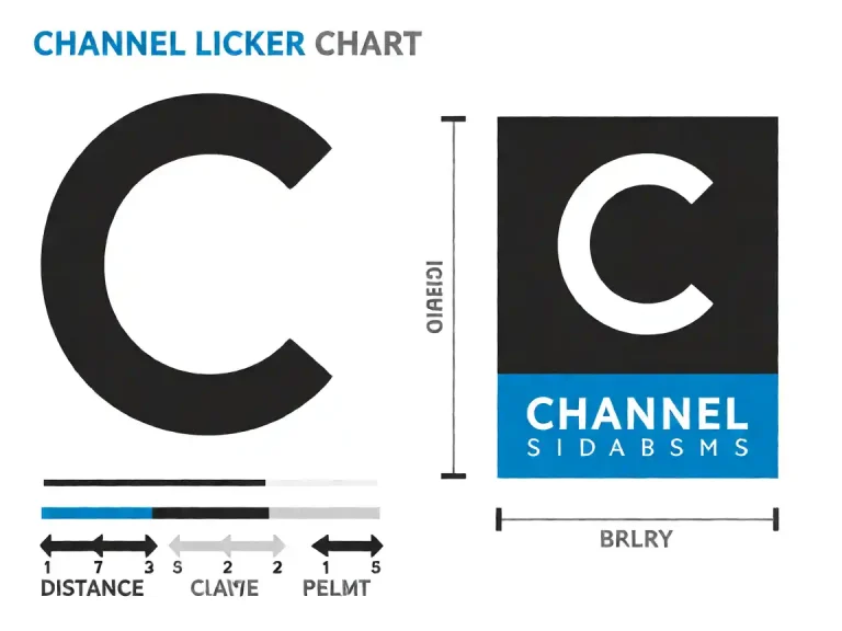
The single most important factor in channel letter sizing is how far your audience will be viewing the sign. A simple rule of thumb guides the industry: each inch of letter height should be readable from roughly 50 feet. Use the table below to determine the minimum letter height for your location:
| Letter Height | Optimal Viewing Distance | Best For |
|---|---|---|
| 6 inches | 100–150 feet | Indoor signs, hallway directories |
| 12 inches | 250–350 feet | Mall interiors, covered walkways |
| 18 inches | 400–500 feet | Strip malls, shopping centers |
| 24 inches | 550–700 feet | High-traffic storefronts, main roads |
| 36 inches | 800+ feet | Highway visibility, large facades |
To measure your viewing distance, stand at the farthest point where a customer would naturally spot your sign—typically the end of the parking lot or the adjacent intersection—and note the distance. If your sign will be viewed primarily while walking (less than 50 feet), you can safely reduce letter height by 20–30% without sacrificing legibility.
The 1-Inch Per 10 Feet Rule
Sign makers have relied on the 1-inch-per-10-feet rule for decades: for every 10 feet of viewing distance, you need 1 inch of letter height. This rule aligns with the data table above and works well for most ground-level storefront applications.
However, several factors adjust this baseline:
- High-speed viewing (highways, freeways): Multiply by 1.5. A 24-inch letter intended for 240 feet becomes a 36-inch letter for highway-side visibility.
- Parking lot viewing: Drivers spend only 3–5 seconds scanning your sign. Add 6 inches to the baseline height for comfortable reading time.
- Corner installations: If your sign is visible from two directions, size for the longer viewing distance, not the shorter one.
- Night-only visibility: Illuminated channel letters improve contrast, but glare from adjacent light sources can reduce effective readability by 20%. Size up slightly if nearby streetlights or competitor signs create visual noise.
Choosing a Font
Font selection separates professional signs from amateur ones. The right typeface turns readable letters into a cohesive brand statement; the wrong one makes even expensive channel letters look cheap or illegible.
Stroke Width and Legibility
Avoid ultra-thin strokes on illuminated letters. Light bleeding from the LED diffusion strips softens fine details, turning elegant hairlines into muddy blobs. A minimum stroke width of 15–20% of the letter height ensures crisp edges at any viewing distance. For a 12-inch letter, that means strokes should be at least 1.8–2.4 inches thick.
Sans-Serif vs. Serif
Sans-serif fonts (Helvetica, Arial, Futura) are the default choice for channel letters because they read faster at distance and don’t suffer from thin serif fragments breaking apart under illumination. Serif fonts can work for luxury brands where the added elegance justifies reduced readability—but only with generous stroke weights and low character density.
Maintaining Brand Identity
If your brand uses a custom or proprietary font, work with your sign manufacturer to digitally adapt it for LED channel letter fabrication. Most custom fonts can be retained with minor adjustments: thickening thin strokes, increasing character spacing, and simplifying decorative elements. The goal is brand recognition, not pixel-perfect reproduction.
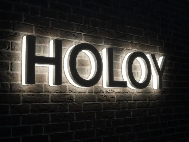
For complex geometric or condensed typefaces, consider how they’ll look at reduced scale. A 3D geometric channel letter set demonstrates how angular designs maintain legibility even with tight character spacing.
Letter Case and Spacing
The choice between all-caps and title case has measurable effects on reading speed and visual weight. All-caps channel letters appear 15–20% wider than title case, creating a bolder storefront presence. Title case allows character height variation (uppercase vs. lowercase) that can add visual interest but may reduce instant readability at distance.
Character spacing—called kerning in typography and spacing in signage—should follow these guidelines:
- Minimum spacing: 10% of letter height between characters to prevent visual crowding
- Optimal spacing: 15–20% of letter height for illuminated channel letters, accounting for light spread
- Maximum spacing: 30% of letter height; beyond this, the eye struggles to group characters into words
For longer business names that exceed your facade width, stacked lettering (two or more lines) maintains readability while fitting the space. Keep each line to 6–10 characters for optimal recognition, and use consistent line heights—typically 120–130% of the letter height.
Measuring Your Facade
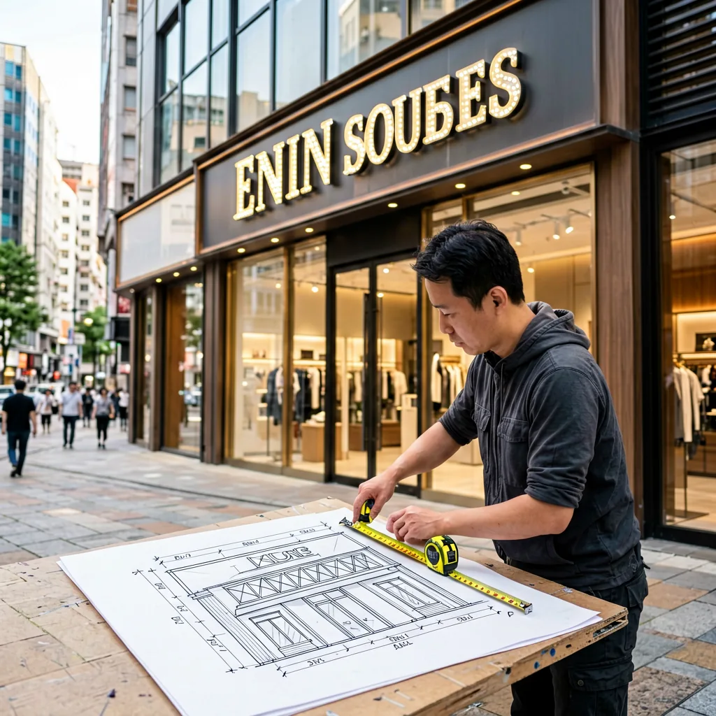
Before ordering, you must measure your building facade accurately. Here’s the step-by-step process:
- Measure wall width: Use a tape measure or laser distance meter to record the full available width between corners, columns, or architectural features.
- Account for obstructions: Subtract space needed for windows, doors, and signage that must remain unobstructed. Most local codes require a 12-inch clearance from property lines and building edges.
- Check sign codes: Many municipalities cap channel letter height or total sign area. Contact your local building department or check their website before finalizing dimensions. Typical residential zone limits: 4 feet height; commercial zones: 6–12 feet depending on façade width.
- Do a mockup: Tape letter outlines to your facade at full scale, or use a marker to draw them directly on the wall. Step back 50 feet and evaluate. This “paper mockup” costs nothing and prevents costly ordering mistakes.
Our large 3D outdoor site letters are designed for maximum facade coverage—ideal for businesses with wide commercial frontages that want a commanding presence.
Ordering Your Channel Letters
When you’re ready to place an order, provide your sign manufacturer with these details:
- Letter height (in inches, based on the viewing distance calculations above)
- Font name or a reference image of your brand typography
- Facade width and any spacing constraints (window/door clearances, property lines)
- Illumination type—face-lit, halo-lit, or open-faced—based on your aesthetic preference
- Material—acrylic faces for vibrant colors, aluminum returns for durability, or chrome-accented letters for a premium metallic finish
Y SIGNS LED offers comprehensive channel letter sizing guides and free design consultations to help you choose the right combination of height, font, and illumination for your storefront. Front-lit LED letters remain the most popular choice for retail facades, offering even illumination and energy efficiency.
Ready to get started? Contact Y SIGNS LED today with your facade dimensions and brand font—we’ll recommend the optimal letter size and provide a custom quote within 24 hours.