
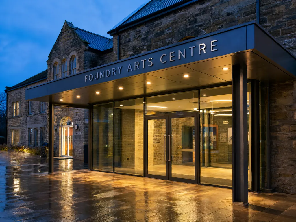
A civic arts centre in Manchester occupies a Grade II listed former warehouse. The brief included a constraint that rules out most signage approaches: the principal facade is listed, and the local planning authority would not accept illuminated lettering, light spill into neighbouring residential windows, or any fixing that penetrated the historic stone.
Why non-illuminated was not a compromise
The usual assumption is that unlit equals budget. In a heritage context the opposite is often true. Removing illumination removes the electrical infrastructure, the maintenance access, and the light-trespass argument — which means the design can be larger, bolder, and more sculptural without triggering objections. It also means the lettering has to work purely on form, shadow, and daylight, which is a harder and more rewarding design problem.
What we built
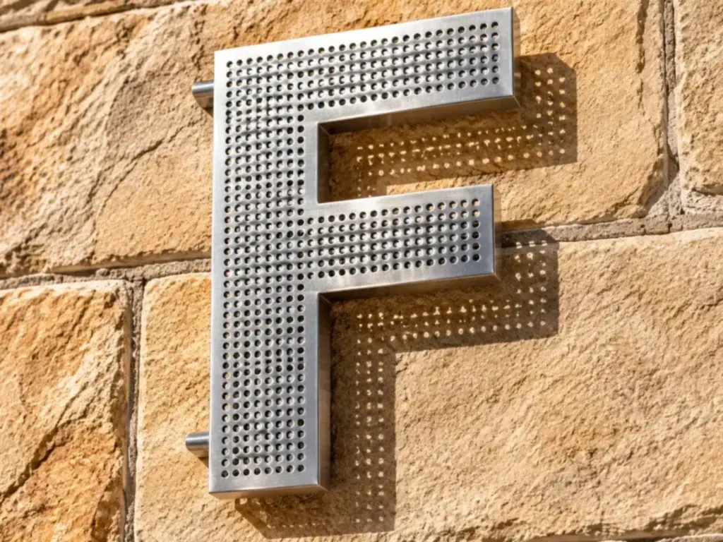
Perforated stainless facade letters. 1.9 m high fabricated stainless letters with a laser-cut perforation pattern derived from the building’s original warehouse window rhythm. The letters are non-illuminated. In daylight they read as solid forms; as the sun moves they cast a perforated shadow pattern onto the stone, which effectively makes the building itself the light source. This was the detail that won planning approval — the sign produces shadow, not light.
Non-penetrating mounting. Because the stone could not be drilled, the letters are carried on a concealed stainless rail system fixed into the mortar joints at low level, with the letters standing off the facade on bespoke brackets. Standoff distance was set at 90 mm: far enough to create a clean shadow line, close enough that wind loading stays within the rail capacity.
Entrance canopy lettering. Flat-cut stainless lettering to the canopy fascia, non-illuminated, with illumination provided instead by concealed downlights in the canopy soffit. This lights the entrance threshold rather than the sign — better for accessibility and for the neighbours.
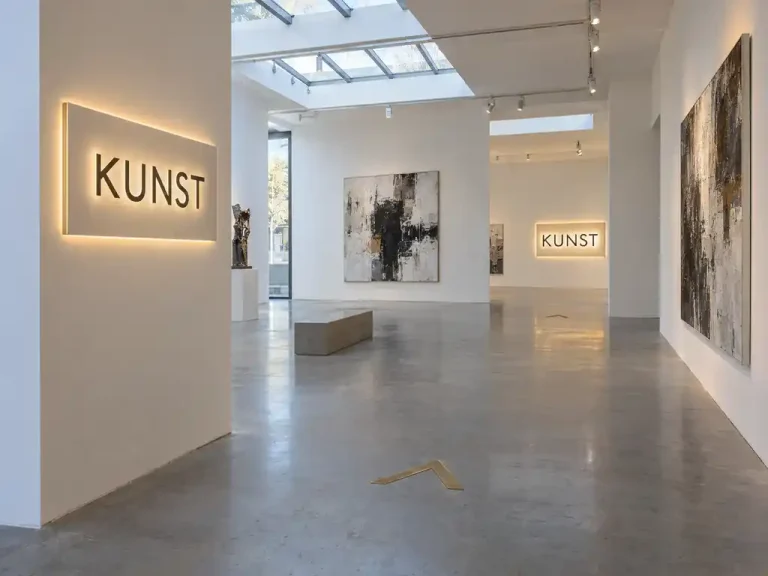
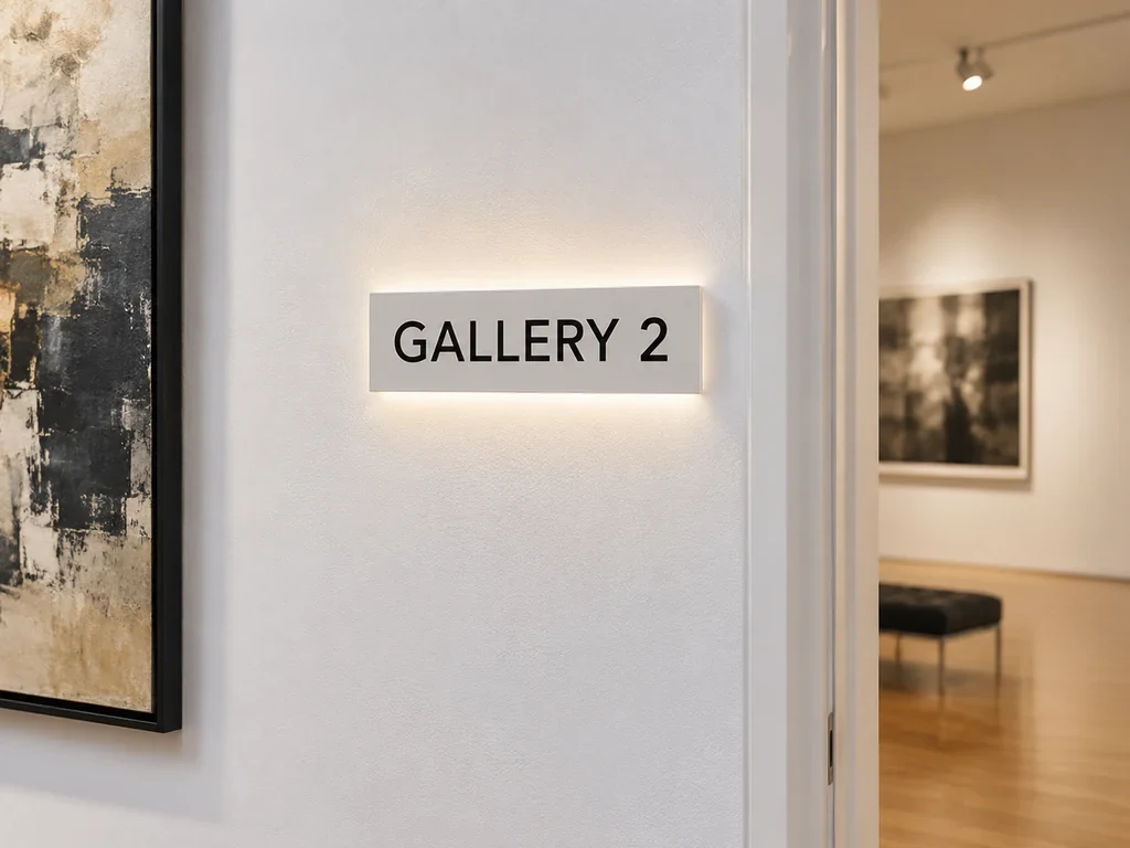
Interior wayfinding and donor wall. Inside the building, illumination was allowed and used: an edge-lit room identification system and a backlit donor wall, both specified at low output to suit a gallery environment where light levels are controlled for artworks.
Result
The facade solved a planning problem that had stalled the project for eighteen months, and the perforated shadow effect became the centre’s visual identity — it now appears on their print and digital material. Interior wayfinding passed accessibility audit with no non-conformances. The non-penetrating rail system means the letters can be removed without trace if the building is ever restored.