The brief
An Australian shopping centre and retail property spread across several trading levels had no single wayfinding language. Each mall entrance carried its own directory board, most of them printed panels behind locked glass, several showing tenancies that had changed hands more than a year earlier. Directional signage had been added piece by piece as the centre expanded — a wall sign here after a refurbishment, a hanging sign there after a new anchor opened — with different typefaces, different panel depths and different colour temperatures. Shoppers found the anchor stores; they did not reliably find the food court, the parent rooms, the click-and-collect desk or the right car park lift.
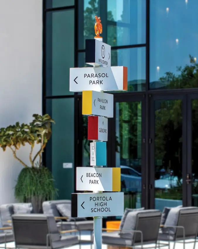
The brief was to rebuild indoor wayfinding as one coordinated system: a freestanding illuminated directory totem at every mall entrance and lift-lobby core that actually explains the level, ceiling-mounted direction signs at the corridor intersections where people stop and look up, and projecting aisle signs on the columns along the main malls so a shopper walking a retail run is never guessing which side of the walkway a tenancy sits on.
What we built
We produced the three sign types as one family, so a directory totem, a ceiling sign and an aisle blade share the same typeface, the same panel depth and the same light output — whatever level of the centre they sit on.
- Directory totems: freestanding illuminated units with soft film light box faces — aluminum frame + stretch fabric (SEG) + LED, with a tool-free graphic replacement face so the tenancy listing can be re-printed without dismantling the cabinet
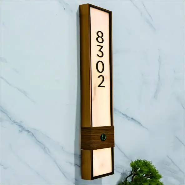
- Totem body lighting: ultra-thin light box panels — aluminum + light guide plate + LED, a 12mm edge-lit profile that keeps the illuminated face flat against the cabinet side
- Ceiling direction signs: backlit oval ceiling signs — aluminum frame + acrylic face + LED, ceiling-mounted on a suspension kit, with a dimmable LED light source so output tracks the centre’s ambient level
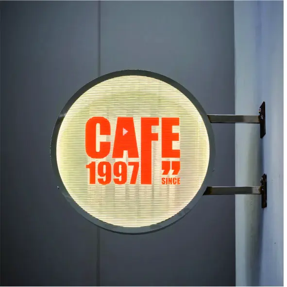
- Aisle and column signs: circular projecting light box signs — steel + acrylic + LED on a wall-mount projecting arm, so the blade reads along the mall rather than across it
- Consistency: one arrow geometry, one panel depth and one LED colour temperature carried across all three sign types, on every level
How the project ran
The centre supplied a floor plan per level, a current tenancy schedule and the destination groups they wanted shoppers to be able to follow — anchors, dining, amenities, parking and services. From that we mapped which destinations belonged on the directory totems, which belonged overhead on the ceiling signs, and which sat at column level along the malls. Scaled layouts went back for review before anything was cut, which is also where the naming was settled: one level name, one spelling and one icon per amenity across the whole centre.
The useful discipline on a multi-level retail property is separating “where am I going” from “what is on this level”. Ceiling signs and aisle blades carry destinations only — short enough to read while walking. Directory totems carry the tenancy listing and the level map, and nothing else. Mixing the two is what makes shopping centre signage feel crowded, and it is why we kept the families visually identical but functionally separate.
Delivery and installation
The order was crated by level and by zone, so each entrance, lift core and mall run arrived as its own set rather than a mixed shipment. Every totem shipped with its 1:1 layout template and wiring diagram; every ceiling sign with its suspension template and every column sign with a mounting template for the column. The SEG faces ship flat and unprinted where the centre wanted to hold the tenancy artwork until closer to handover, which also lets them re-print a single level listing later without touching the cabinet or re-ordering a whole sign.
The centre’s own contractors handled the physical fit-out and the electrical connection, keeping site access, after-hours work and landlord approvals under the centre’s control rather than ours.
Outcome
A shopper now follows one continuous line: a lit directory totem at the mall entrance, a matching ceiling sign at the next intersection, and the same signage grammar again at the column outside the tenancy. Because every part of the system was produced from one set of files, the centre can refresh a level listing, add a newly opened tenancy or replace a single damaged blade without reopening the design — the totem stays, the graphic changes.