The brief
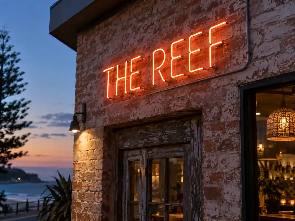
A hospitality operator running a bar and an adjoining all-day restaurant in Australia wanted the two rooms to read as one brand after dark. The fit-out was already warm — timber, brass, low pendants — but nothing on the walls carried the brand once the sun went down, and after service the bar and the dining room felt like two unrelated businesses.
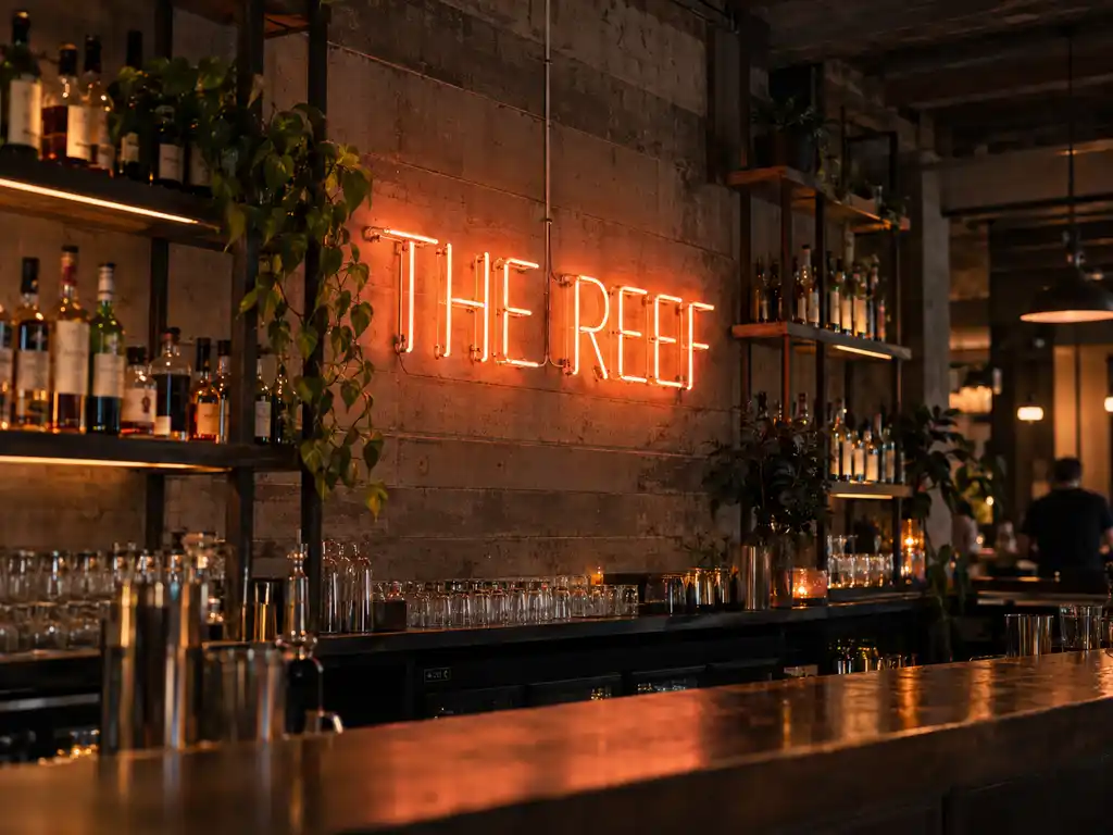
The brief was deliberately narrow. A hand-drawn script piece for the main bar wall, a smaller logo-driven sign for the restaurant pass, and a set of low-glare accent features that could carry the room from dinner service into late-night trade. Everything had to share one colour and brightness standard so the venues felt related, and nothing had to be bright enough to fight the existing lighting design.
What we built
All of the pieces were produced from a single artwork pack, so the script signs, the logo sign and the accent letters share one visual language instead of looking like three separate purchases.
- Script signage: custom-shaped LED neon flex on a clear acrylic backing, cut to the venue’s own handwritten lettering
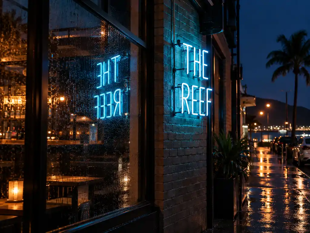
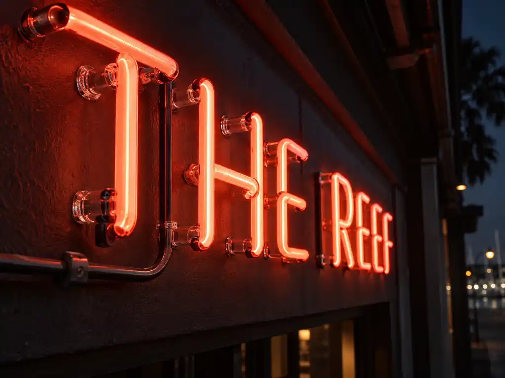
- Logo signage: LED neon flex set into a stainless steel frame for the sign above the restaurant pass
- Accent features: alphabet-series neon letter sets used as a soft wall feature behind the banquette seating, rather than as a second logo
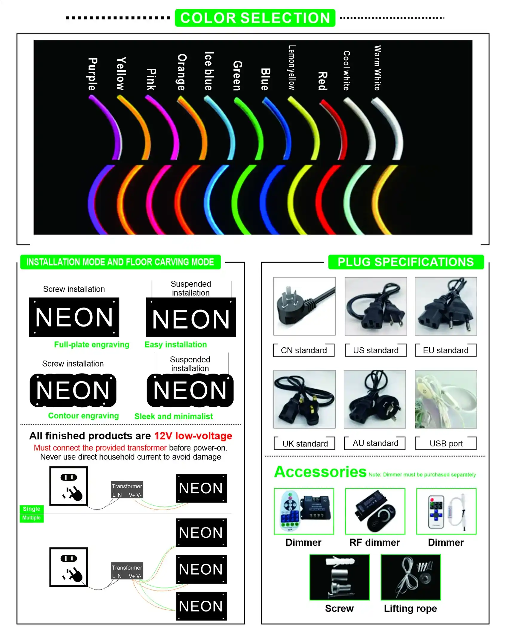
- Electrical: 12V LED neon flex on remote drivers, so the low-voltage runs stay hidden inside the joinery
- Lighting character: warm white for the dining room and pass, multi-colour for the late-night bar pieces
- Mounting: pre-drilled acrylic backings on stand-off fixings, with 1:1 paper templates supplied for the joiners
- Zones: interior-rated units for the bar and dining room, weatherproofed units for the covered terrace
How the project ran
Interior neon is judged in the room, not on a screen. Work started with the client’s artwork and a set of site photographs showing wall finishes, available power points and the sightlines from the entry and the bar. From that we returned a scaled layout so the client could see exactly where each piece would sit and how large the script would read from across the room.
The script piece was the one real risk. Hand-drawn lettering has thin joins and long tails that behave differently in flexible neon than they do in a vector file, so we produced a single full-size prototype of the opening word for sign-off before committing the rest of the set. Once the client approved the stroke weight and the warm-white colour against the actual wall finish, the remaining pieces went into production against the same reference.
Because the bar and the restaurant were fitted out by the same joinery team, we could also align the mounting heights so the signs sit on one continuous eye-line — a small detail that does most of the work in making the two spaces feel like one venue.
Delivery and installation
The finished pieces shipped by air freight in individual crates with the fixing hardware, remote drivers, wiring diagrams and installation notes packed alongside them. Local contractors handled the physical installation, which kept the client’s own trades in control of access hours and made it possible to work around service times.
Remote drivers were specified deliberately for this project: they keep the low-voltage connections inside the joinery rather than behind the sign face, which simplifies both the initial fit-out and any future change to the wall.
Outcome
The venues now carry the same brand face from the first dinner sitting through to last orders. The script piece reads as the venue’s own handwriting rather than a stock neon font, the accent letters add depth behind the seating without competing with the pass sign, and the covered terrace extends the same light language outside.
The client holds the approved production files for every piece, so a damaged unit or a future second site can be ordered against the original artwork and match the existing signage exactly. If you are planning something similar, the pieces used here are the custom shaped neon lights, the vintage neon letter signs and the neon signs alphabet series.