The brief
A credit union & branch banking network in Canada was opening a new branch on a suburban arterial road, with a drive-through ATM lane that has to stay usable around the clock. The building shell was handed over with no exterior identity at all, so every street-facing element had to be created from zero: the branch name on the facade, a 24-hour marker over the ATM lane, a freestanding sign at the road edge that a member could read from a moving car, and directions to the ATM and night-deposit lanes.
Three constraints shaped the work. Canada is a bilingual market, where English and French carry equal status on public-facing signage — both language lines had to stay legible at the same distance, rather than one being shrunk to fit underneath the other. A credit union branch also reads differently from a retail storefront: the signage has to signal permanence and security rather than promotion, and the ATM identification in particular has to mark a service that is available when the branch lobby itself is closed and dark. And a Canadian branch day starts before sunrise and ends after dark for much of the year, so the signage had to perform through low winter sun, wet nights and long dark hours while staying inside the sign bylaw envelope on that frontage.
What we built
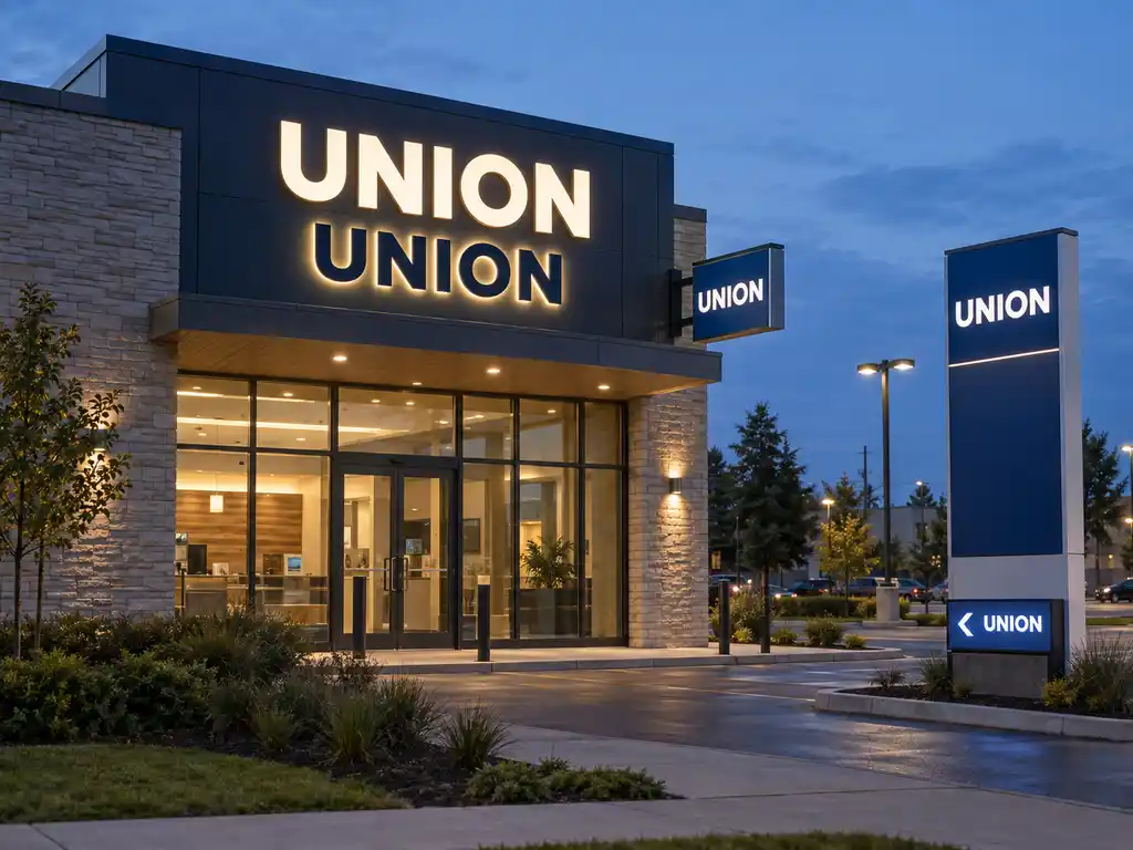
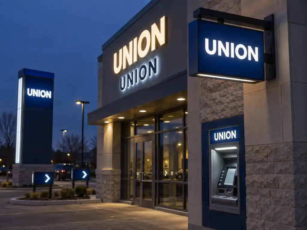
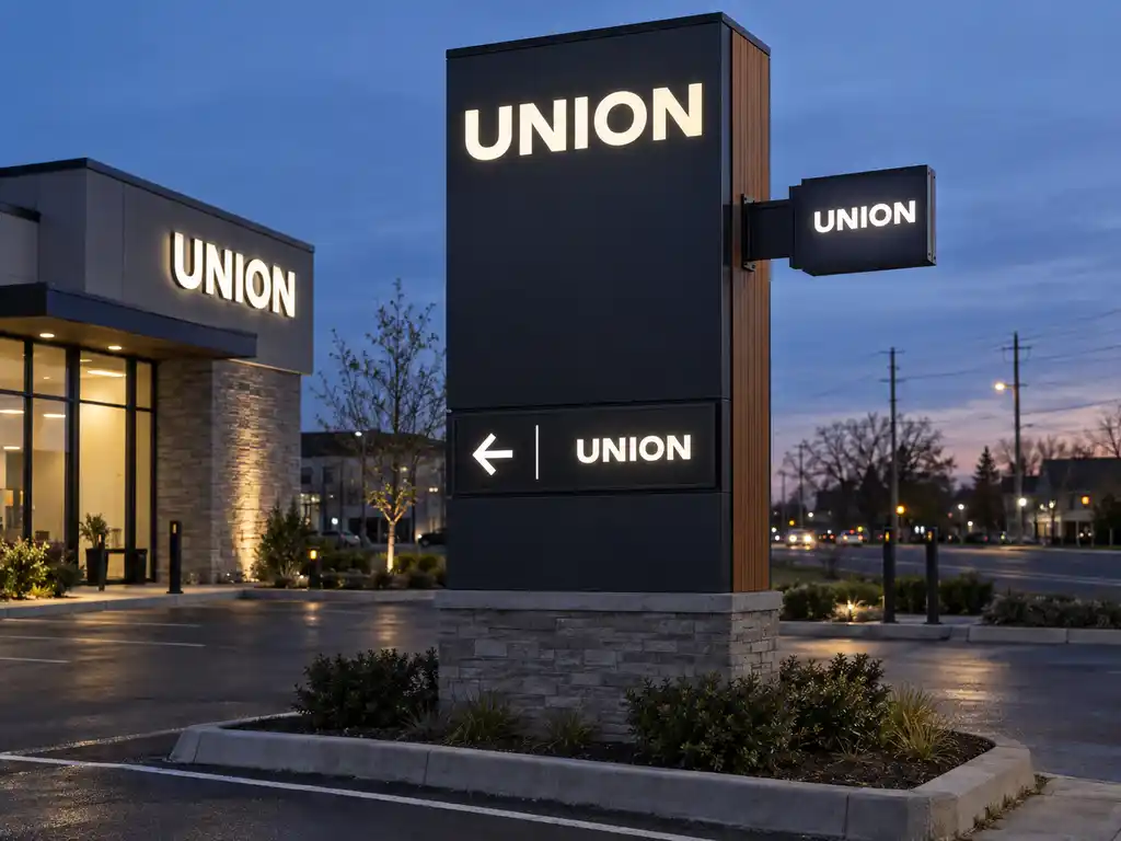
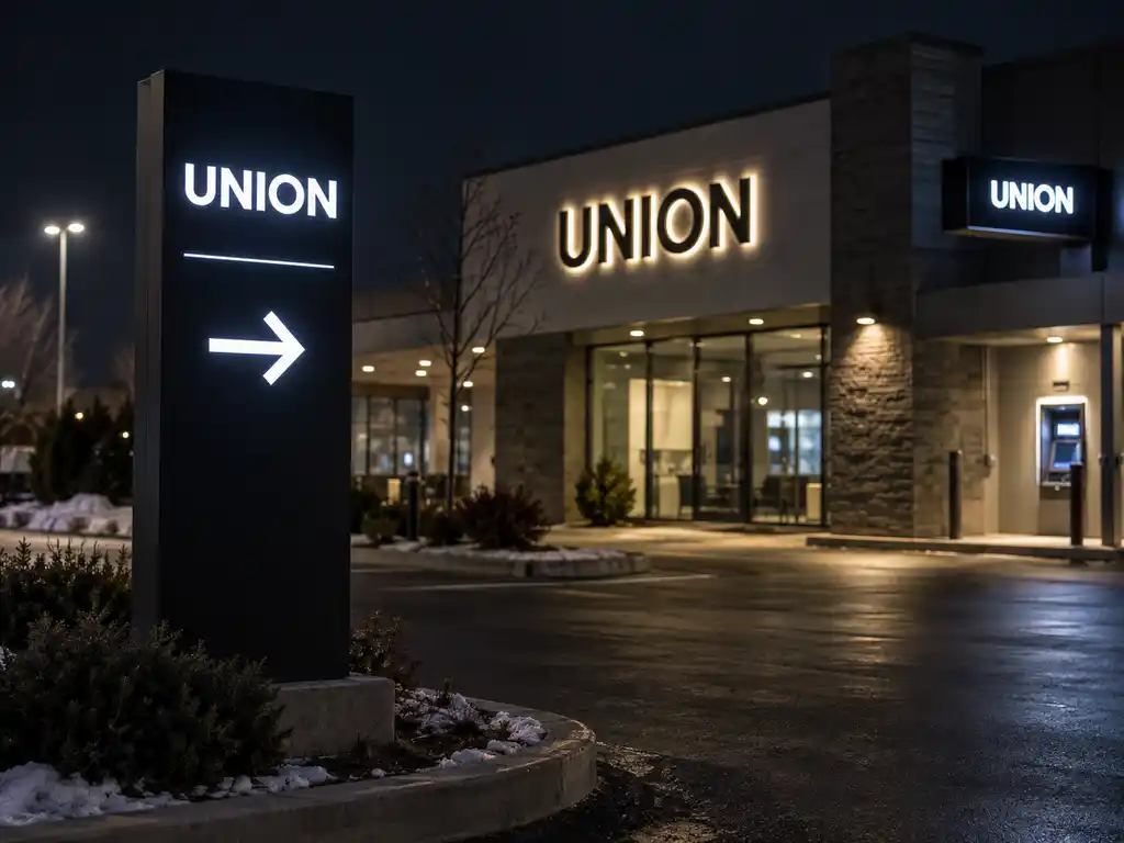
We delivered a four-part exterior system produced from one bilingual layout: illuminated entrance letters on the facade fascia, a projecting 24-hour ATM identification sign, a freestanding pylon cabinet at the road edge, and illuminated directional blades to the ATM and night-deposit lanes. All four use the same typeface, the same return depth and the same LED colour temperature, so the building and the roadside sign read as one identity from the street.
- Facade lettering: white 3D back-lit channel letters with high-brightness LED behind a diffusion face — an even, shadow-free glow across each stroke instead of the hot spots you get from an undiffused module layout
- Second language line: electroplated stainless steel back-lit letters for the French line, so it reads as solid polished metal in daylight and as a soft halo after dark, holding its own against the brighter line above it
- 24-hour ATM sign: a circular projecting light box on a wall-mounted arm over the ATM lane, with a steel housing and an orange illuminated acrylic face — a shape and a position that read from the drive-through, from the sidewalk and from the road, and that stay lit through the branch’s closed hours
- Pylon cabinet: a double-sided 304 stainless steel light box body with weather-sealed edges, front-access panel replacement and custom proportions matched to the bylaw envelope on that frontage
- Illuminated faces: sandwich luminous construction on the cabinet faces — aluminium composite back panel, LED matrix and a uniform light diffusion layer in a slim profile, which is what produces even panel light with no visible modules
- Bilingual typography: English and French set at the same cap height in two stacked lines, with French diacritics cut as part of the letterforms rather than added as applied vinyl that peels at the edges
- Lane wayfinding: a pole-mounted illuminated directional signpost carrying stacked arrow blades to ATM, night deposit and parking, dusk-to-dawn illuminated and kept visually identical to the pylon so the two do not look like separate sign schemes
- Illumination: externally accessible LED modules and drivers inside sealed housings, so a module or a driver can be swapped from the face side without dismantling the cabinet
The facade letters come from our white 3D back-lit channel letter and electroplated back-lit letter ranges; the ATM marker is built on our circular projecting light box sign; the pylon combines the stainless steel light box body with sandwich luminous faces; and the lane blades come from our illuminated directional signpost range. Because all of them are standard ranges, a replacement letter, a new blade or a spare cabinet face later re-orders against the same production file.
How the project ran
The credit union supplied its architectural elevation drawings, the bylaw envelope for the frontage and the exact spelling of both language lines. We returned scaled layouts showing the letters positioned against the fascia and canopy joints, the pylon sized against the permitted height and setback, the projecting ATM sign set at a height that clears the drive-through clearance envelope, and both language lines proofed at equal cap height.
The bilingual layout is where most exterior signage for financial branches goes wrong. The usual shortcut is to set the English line large and drop the French line underneath in a smaller size, which is immediately readable as a hierarchy that was never intended. We proofed both lines at the same height, adjusted only the tracking to balance the two line lengths, and confirmed the diacritics — the accents on the French characters — as cut letterforms rather than applied overlays. On the ATM sign we kept the message to the two things a member needs at 11pm: that this is an ATM, and that it is available 24 hours. Anything further competes with the graphic at the distance the sign is actually read from.
Once the layout was approved we produced one finished facade letter, one ATM sign and one pylon face panel as physical samples, so the credit union could check the finish, the return depth and the light temperature in daylight and after dark before the full set went into production. The remaining letters, the projecting unit and the cabinet were then finished in one batch, which keeps the plating tone and the LED colour consistent between the facade, the ATM lane and the roadside sign.
Delivery and installation
The set shipped in three crates — letters and mounting hardware in one, the projecting ATM unit and its wall arm in the second, pylon cabinet, pole sleeve and faces in the third — each with a 1:1 paper template, a wiring diagram and the bolts, spacers and washers for the concealed fixings. The credit union’s electrical contractor needed the templates and the connection points only, not a second survey, because every element was produced from the approved elevation rather than measured on site.
For Canada, the permit drawings are the long pole in the tent, so we supply shop-style dimensioned layouts and material and illumination notes in the format the contractor submits locally, and confirm the applicable electrical and structural requirements with that contractor before production. The pylon shipped with its pole sleeve so the footing could be poured and cured while the cabinet was in transit, and the projecting ATM sign was drilled and bracketed to match the elevation so the facade was opened once. That kept the installation to a single site visit per elevation.
Outcome
The branch now has one exterior identity that works at every distance it is read from. From the road, the pylon is legible well before a driver reaches the turning; over the ATM lane, the projecting sign identifies the machine and its 24-hour availability from the drive-through and from the sidewalk; at the entrance, the lettering locates the door after dark without glare spilling onto the residential side of the site. Both language lines carry the same weight, so neither reads as an afterthought.
Because the facade letters, the projecting ATM sign, the pylon cabinet and the lane blades were all produced from one approved file, a future second branch or a replacement element can be reordered against the same standard instead of a fresh design round — which matters for a branch network that expects to repeat its identity across many locations.